
Executive Summary:
Where previous bootcamp students had tried and failed to scrape Amazon for price history data, I succeeded—not by being smarter, but by taking a more creative approach. I instead scraped a third party site that tracks Amazon—CamelCamelCamel—and recreated Amazon price data by analyzing graph images displayed on the site. I didn’t actually scrape Amazon, but I successfully obtained the same data (within a fraction of a percent rounding error) by cross-applying my skills in image analysis in a different domain.
Motivations:
Amazon price data is freely available through the Amazon API, limited at a generous 1 million API calls per month. As a competitor or consumer on the marketplace, price history data are extremely useful and can drive much wiser decisions about when and what to buy and at what price. But seeing the current prices (that’s all they provide) only gives a fraction of the total picture: how do the current prices compare with prices from the recent past? When deciding to purchase or sell a stock or trade in foreign currencies, one would naturally want to look at the price or exchange history. Analogously, what about Amazon price history data? Such historical pricing data were apparently available directly through an Amazon service in the past, but today Amazon does not provide such a service and does not make it possible to scrape such data directly from the Amazon web system, leaving consumers and retailers to search for this information elsewhere. As these price history data are quite valuable, websites do exist that provide access to such information; among these are CamelCamelCamel and Tracktor. (Terapeak allows pinging price history for Amazon items, but at a paltry 500 API calls per month.) These websites make the data available in graphical form only, perfect for letting consumers and retailers quickly and qualitatively improve their decisions to buy or sell at optimal times. By not directly providing the underlying data themselves, these websites protect their business model of providing access to difficult-to-come-by information. This has the side effect of preventing more quantitative analysis on the pricing data, which would also be of great utility to sophisticated, data-minded business in very competitive markets. I set out to obtain such a rich data set as a proof of concept of the following web scraping approach, which combines traditional web scraping using sophisticated tools like the Selenium webdriver along with rudimentary image analysis. I top off the proof of concept with a brief quantitative analysis of the data set itself—as an example of how a business might use such data—in the findings section.
Between the two more prominent choices of Amazon price trackers, I chose to use CamelCamelCamel, as it tracks vastly more items than Tracktor and records more information on each item than Tracktor. The CamelCamelCamel site (according to their robots.txt file) does not prohibit scraping, though they have made the barrier for scraping the data quite high (it is their business model, so there’s good reason to protect it). Traditional/simple approaches with scrapy come back without ever having reached the site. More advanced approaches like Selenium (which mimics an actual web browser like Chrome to near-perfection) are even occasionally detected and CAPTCHA-blocked (blocked with a Turing test a computer typically can’t solve yet which is easily solvable for humans) by the site. The best I managed to do, with a Selenium-based Chrome web-driver with built in random, log-normal delays so as to approximate a human’s pace while perusing a site, was a CAPTCHA block every 15 minutes or so. There are services that will solve CAPTCHAs using mechanical Turks in Indonesia and the like, but I elected to just set a rotating 15-minute alarm and briefly interrupt my other coding work to solve a CAPTCHA myself so the scraping could continue.
The text data I collected from the site included textual classifications of the product as well as its Amazon ID, title, and the highest and lowest prices it had achieved during the past year. Conveniently, those two price points allowed me to calibrate the y-axis of the price history graph image. I designed a method that would find the boundaries of the graph panel within the image, trace up the right-hand border pixel-by-pixel until it found the colored price line, and then trace that line from right to left across the image, jumping over gaps in price coverage as necessary. It did this separately for Amazon-sold items, third party new items, and third party used items (each had a different color in the graph). I wrote a function to edit the URL such that the graph image would display to an arbitrarily large size (an oversight, perhaps, by the folks at CamelCamelCamel), allowing me to achieve greater precision in my calibrations and obtain uniformly-sized graph images for each product.
Example Graph (Amazon in green, 3rd party new in blue, 3rd party used in red):
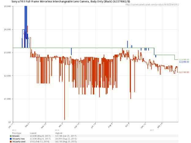
As I do not have access to the actual raw data, I have no way of performing conclusive error analysis, though I’ve recreated the graphs from the scraped price data and found that they overlap very consistently. As the maximum price and minimum price were used to calibrate the image, their error was expectedly quite low (within a rounding error). However, I was able to compare the most recent price in the scraped data to the most recent price visually imprinted in the graph image and found that they were within a dollar of each other for items costing a few hundred dollars (~0.5%), which should be sufficiently low for informative analysis.
Example 3rd party used graph vs scraped results re-graphed:
Findings:
As a photography enthusiast, I couldn’t help but investigate one of the age-old questions in the photography community: Canon vs Nikon. Additionally, as a fan of Sony’s new Alpha series cameras (including the A7RII/III mirrorless line), I threw in Sony for comparison. How do prices and price volatility compare between these three large camera brands?
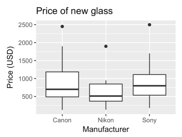
Sony has more expensive lenses on average, having made large strides into the mirrorless market recently.
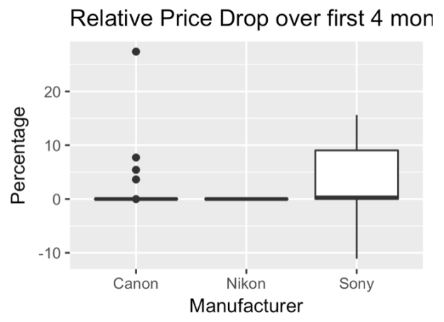
However, Sony has been expanding into the mirrorless market at a very aggressive pace, releasing more cameras in a year or two than Canon or Nikon may in a decade. Perhaps as a result of this, Sony’s cameras show a much faster price drop over the first four months than both Canon and Nikon cameras.
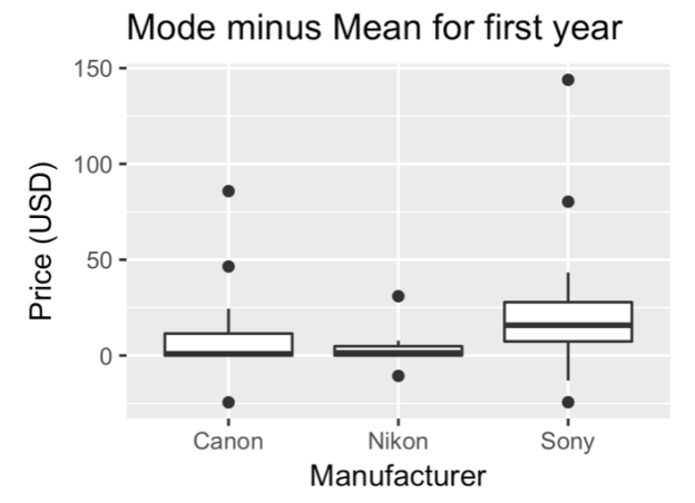
I tried to measure “flash sales” (i.e. sales that exist only for a very short period of time) using the mean price (which will be skewed by extreme values) subtracted from the mode price (which represents the “sitting” or standard/normal price of the items), and I found that Nikon has relatively stable prices (and Sony’s as expected, are the most volatile).
Sony’s prices also had a larger standard deviation within the third-party new and Amazon-sold categories, consistent with company sales. Canon’s prices showed a larger standard deviation in the third-party used market, perhaps showing that Canon users have a more active used gear market (which matches with personal anecdotal observations, for what it’s worth).
Although more analysis could easily be done, the point of such efforts is as a proof of concept that creative approaches to web scraping can yield data that are otherwise unaccessible.
