Featured post

Re-learning English: Pluralization and Lemmatization

Links to code on Github: the singularizer and pluralizer, and the lemmatizer


Executive Summary:

I created a word lemmatizer in R and Python that automatically “digests” words down to their core form for the purpose of dimensionality reduction for NLP (Natural Language Processing) tasks. The lemmatizer works by recognizing formulaic endings to English words, yet handle enough special cases that they outperform stemmers such as Porter and Snowball in accuracy. Because this lemmatizer relies on structured word endings, it is less dependent on external dictionaries than most lemmatizers such as WordNet, and as such, it performs nearly equally as well on real or invented words that do not appear in dictionaries (unlike WordNet).


Motivations:

My motivations starting this project were simple: dig my hands deeper into NLP (Natural Language Processing) and develop useful code for myself where other code wouldn’t (or wouldn’t quickly) work. What started as a quick exploratory fix on my Wikipedia Spark project then turned into a substantial sub-project that carefully handles English words; I will focus on the final product here.


There are two main camps for dimensionality reduction in the NLP word: stemming and lemmatization. Stemmers (usually) simply chop off endings in an attempt to eliminate relatively meaningless differences in phonology (e.g. does the analysis really depend on whether he walks or I walk? The key idea is walk in both cases). While useful for their speed and simplicity, they suffer from an overly simplistic approach to manipulating words that results in many disconnected similar words (e.g., multiply and multiplication stem to similar but distinct terms, a type II error of sorts) as well as many spuriously connected words (e.g. universal, university, and the made-up word universion all stem to univers, a type I error of sorts). Lemmatizers, on the other hand, seek to capture the “lemma” or core/root of a word by looking through relationships in dictionaries. With lemmatizers, phonologically difficult relationships like that between better and good are accurately captured, so they’re very useful when accuracy is needed (especially for reduction of type I errors/overstemming). However, with a lemmatizer, one often has to put in extra under-the-hood work to link together related words of different parts of speech, first detecting the part of speech (with error) and then traversing the web of derivationally related forms (and synsets and pertainyms, etc.) until one decides on a “root” form. Furthermore, words not captured by the dictionary can’t be handled properly, which is a more common problem than one would expect. For instance, what’s the relationship between carmaker and carmaking? WordNet, one of the most powerful and popular lemmatizers (used by the popular NLTK package), doesn’t know, as carmaking isn’t defined. Undefined words can be accurately processed by stemmers (the carmaking example is, for example) but pose a real problem for many lemmatizers. Clearly there is a middle ground between the overly general world of stemming and overly specific world of lemmatizing, so I set out to create a program that would find it.


English as a language is characterized by its decentralization and archaic spelling as well as its repeated (though occasionally inconsistent) use of patterns to generate inflectional forms. This fact requires a mix of dynamic/rule-based approaches (to generalize the inflectional system) as well as static/case-based approaches (to successfully handle legacy spellings and manage the confusing mixture of Latin, Greek, French, and Anglo-Saxon morphology that characterize English words).


So, I created the “word digester” to combine the best aspects of stemmers (simplicity/ease of use; usefulness on words left out of the dictionary) with the best aspects of lemmatizers (comprehensiveness; handling of special cases; readability of outputs). It will take any English-like word (newly invented or well-established) and digest it into its core form. It handles enough special cases to be useful on some of the more peculiar English word forms, yet it uses enough general rules to be useful without relying on a dictionary. It’s not prohibitively slow either (digesting a 20k-word dictionary in roughly 1-3 seconds in both R and Python). Admittedly, as a recent personal project of definite complexity, there are still plenty of gaps in its coverage of special cases, which can be fixed in time. Below I’ll highlight a few examples that highlight the capabilities of the word digester and also discuss the singularizer and pluralizer functions I created as a companion project to the digester.


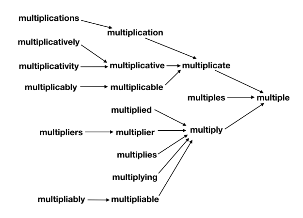
The (real or invented) words multiple, multiples, multiply, multiplied, multiplies, multiplier, multipliers, multiplying, multiplication, multiplications, multiplicative, multiplicatives, multiplicativelymultiplicativitymultiplicativeness, multiplicationment, multiplicativement, antimultiplicative, unmultiplicative, nonmultiplicative, dismultiplicative, multiplicate, multiplicating, and potentially more all reduce to multiple.


It handles some of the most relevant Latinate or Greek plurals as well: symposia and symposiums both reduce to symposium, and lemmata and lemmas both reduce to lemma, for instance, and the pluralize function allows selective creation of either plural form in the reverse direction. In addition, hypotheses reduces to hypothesis, matrices to matrix, series to series, spectra to spectrum, phenomena to phenomenon, alumni to alumnus, and so on.


Anglo-Saxon-style forms are also covered: berries reduces to berry, cookies to cookie, leaves to leaf, children to child, oxen to ox, elder to old, (wo)men to (wo)man, people to person, brethren to brother, and so on.


Many irregular changes are covered: pronunciation reduces to pronounce, exemplify to example, redemption to redeem, tabular to table, operable (and the made-up but more regular-looking operatable) to operate, despicable to despise, grieve to grief, conception to conceive, flammable to flame, statuesque to statue, wholly to whole, shrubbery to shrub, and so on.


Sensible words outside the dictionary are also properly handled: both buttery as well as butterific reduce to butter, and planning as well as the E.U.-favored planification both reduce to plan. Feel free to make up your own words and try them; currently only some rules are sufficiently generalized, so while antidisestablishmentarianismesquely reduces to establish, I can’t promise that every made-up word will be processed correctly.


I’ve verified, semi-manually, the digester’s results on a few corpora: a 1k-word corpus, a 20k-word corpus, and a 370k-word corpus. No errors were made with the 1k corpus; nearly all of the 1200 or so purported errors (defined here as digested word results that do not also appear in the same source corpus) made on the 20k corpus are either—from most common to least common—errors on proper nouns (expressly not intended to be handled by the function as other methods exist for that purpose), real words that do not appear in that corpus (not an error), or genuine errors that I haven’t bothered to fix yet (estimated on the order of 10 or so). This implies a true error rate of around 1% or less on the 20k-word corpus. I have skimmed through the purported errors on the 370k-word corpus (~47k of them), and have similarly found that most of the purported errors either are on proper nouns, are not real errors at all, or are on exceptionally rare, esoteric, often medicinal or taxonomical words (as these make up most of the 370k-word corpus to begin with as a consequence of the Zipf distribution of word frequency).


How does it work? Take a peek at the code on Github to see for yourself—though it is long, it is well-commented and fairly self-explanatory. The basic process involves handling each of the many recognized suffixes in the order in which they almost universally appear in words. Special cases are handled before the best-guess set of general rules handle the suffixes. Masks are used to hide words that have suffix-like endings that should not be removed. One of the most difficult aspects of making the digester as accurate as possible was designing an effective regex test to determine whether an ultimate “e” should remain attached to a word after suffix removal. The suffixes are handled in groups, in which only relevant subsets of words (those that end with something that looks like the suffix in question) are handled for efficiency. Writing some aspects of this code in C would certainly greatly speed up computation, but there isn’t any need for that on most scales as is, as I’ve designed the code such that it does not scale directly with the size or length of the input, but rather with the cardinality of the input (i.e. it handles each unique word only once).


The order I’ve used for processing is:

  • singularize plural forms
  • remove contractions
  • fix irregular common words (all as special cases)
  • remove certain prefixes (with a mask to prevent similar non-prefix forms from being removed)
  • remove adverbial ly suffix
  • remove noun-form ness and ity suffixes
  • remove adjectival esque and ish suffixes
  • remove adjectival able and ible suffixes
  • remove noun-form hood suffix
  • edit miscellaneous Saxon- and French-style suffixes
  • remove istic, ist, and ism suffixes
  • remove adjectival al, ial, ical, ual, and inal suffixes
  • remove adjectival ian suffix
  • remove adjectival ary suffix
  • remove noun-form ment suffix
  • remove adjectival ic suffix
  • remove adjectival ous suffix
  • remove adjectival ful and less suffixes
  • remove adjectival ar and iar suffixes
  • edit noun-form ance and ence suffixes
  • remove adjectival ant and ent suffixes
  • remove adjectival ive suffix
  • remove noun-form age suffix
  • remove noun-form tion and ion suffixes
  • remove noun-form ery suffix
  • remove adjectival y suffix
  • remove noun-form itude suffix
  • edit noun-form ysis suffix
  • remove comparative and doer-form er suffix
  • remove superlative est suffix
  • remove verb-form ed suffix
  • remove verb-form ing suffix
  • remove verb-form ify suffix
  • remove verb-form ize suffix
  • remove verb-form ate suffix
  • fix miscellaneous verb forms to similar noun forms (e.g, multiply to multiple)


Re-Learning English multiple.png

What’s important to note is that each step along the way, the suffixes are removed such that a valid word is produced. In this way, the transformation pipeline functions such that it “collects” different derivationally related forms on their way toward the base form, analogously to how a river’s tributary system works. As such, any failure of the system to properly join one subset of derivationally related forms into further pathways toward the base form will leave that subset as a single valid (albeit not completely basal) word instead of creating something new and unrecognizable. Additionally, this design makes debugging and adding extra special cases easy, as each special case only need be handled once in order for all its derivationally related forms to also be successfully processed. Similarly, it’s straight-forward to force the system to not join together some branches if desired––the change need only be made in one place.


Coda:

I initially coded up these functions in R, though wanting to expose it to wider use, especially within the NLP universe (which is very Python-centric), I transcribed the code into Python with the help of an R-to-Python transcription program I wrote myself. To learn more about that process, see this post.

Featured post

Validating Geospatial Data without API calls

Executive Summary:

I developed a process for cleaning and validating historical data (specifically World War Two bombing data in this example), for which machine learning techniques are not readily appropriate as error is indeterminable with no available training labels. I transformed the data from being prohibitively inconsistent and dirty to only showing few and subtle errors in geospatial information using a carefully constructed data cleaning pipeline and a new and quick way of forming classification decision boundaries I developed for this project.


Motivations:

As might be expected for decades-old government records, the geospatial data I had in my hands for my Shiny project was prohibitively messy for graphing outright (e.g., with European cities showing up in Africa and Asia, among other similar issues) and needed to be thoroughly cleaned. The slight redundancy of the data (consisting of a city, a country, a latitude, and a longitude) offered hope of this despite significant missingness and outright errors. Below I outline the approach I took for cleaning the data, specifically data for World War Two, as it needed the greatest extent of cleaning.


Examples:


This slideshow requires JavaScript.


There were many kinds of errors, the most prominent of which were cities obviously belonging to one country appearing associated with another real country (in an relatively unpatterned manner) and apparent OCR (optical character recognition) or data-entry mistakes, which I presume to be responsible for the frequent misspellings of cities and errors in recorded latitudes and longitudes.


Cleaning of such data from a recent (non-historical) context would be easier, as one can simply use Google’s Maps API to check city and country of each latitude-longitude pair (no machine learning or machine learning approximations necessary). For one, however, such approaches cost money for more than a small volume of API calls, prohibiting me from using them to validate my hundreds of thousands to millions of rows of data. More fundamentally, however, is the problem of historical changes: Yugoslavia (for example) no longer exists, and even if its shadow is still fairly recognizable on modern maps as a composite of descendant countries, many borders themselves have changed since the World War Two era, making such external validation less valuable. Instead, I developed a method of sufficiently cleaning and validating the data internally by carefully making select edits in the data pipeline in a methodical order and with a new (and quick) decision boundary formation technique.


In order to optimally clean this data, I had to consider the contingencies of fixing each kind of data error on fixing (or potentially introducing) further errors of other types. I’ll outline the rough logic for my resulting solution below, but first, the order:


  1. Discover and fix incompletely-named cities
  2. Reassign city and/or country values for minority data clustered at the same location as other similar data with different city and/or country values
  3. Discover and fix off-by-integer errors in latitude and longitude for each city
  4. Find cities with high variation in their latitude and/or longitude values and reassign city/country values if those coordinates better matched other cities
  5. Fill in missing country values for cities that already agree on coordinates
  6. Make each coordinate fix its country by predicting which country it should be in based on its coordinates and the sizes of the countries:
    1. Leaving the country value as is if it’s at least rank 2 in confidence and reasonably close
    2. Updating the country value to the top prediction otherwise
  7. Filling in missing country values by city
  8. Filling in missing country values by coordinate
  9. Fix city spellings based on string distances
  10. Fill in missing city values by coordinate
  11. Mean-impute coordinates by city


City values were important to fix earlier on, as they relate closely to both coordinates (being closely clustered geospatially) and to country (usually having a unique name within the overall namespace of cities and uniquely mapping to a country), so I picked off the low-hanging fruit of incomplete city names first to ensure that more relevant data were available to fix coordinates and countries. I only fixed incomplete city names as opposed to similar misspellings because the checking for misspellings was prohibitively computationally expensive without first segmenting by country (and at this point, there were still many errors in the country values). (By this point in the data cleaning process, all country misspellings had already been fixed with my replace_levels function, as the number of countries was feasibly low enough to handle manually.)


Another quick fix of errors of relatively high confidence is allowing majority-rule voting for the correct country and city values for data all at the same coordinates.


With cities more reasonably linked to coordinates at this point, it was possible to search through each city for off-by-integer data-entry errors in the latitude and/or longitude coordinates (as no city occupies even close to one degree of latitude’s or longitude’s worth of space, and such single-digit mistakes were common).


After fixing data entry errors on coordinates, it was possible to fix data entry errors on city/country values by sifting through cities with high variance in either coordinate and detecting matches to other existing cities.


Before we use country value information, it helps to fill in what data we can there, so coordinates linked to one and only one country were filled to all link to that country.


Finally, on to the decision boundary metric:

I predicted which country’s territory a location existed in by measuring the Euclidian distances to country centroids normalized by country size. I first generated the centroid locations by averaging existing latitude-longitude pairs for each country (finding the country’s center of mass) and then tweaking it manually as I identified mistakes.


Importantly, it’s unreasonable to assume that each coordinate simply belongs to the country it’s geographically closest to (using the non-normalized Euclidian distance), as in that case much of western Germany’s and northern France’s territory would look like it belongs to tiny Luxembourg. Instead, when relative country territory sizes are taken into account, the decision boundaries that form roughly approximate the map even without explicitly modeling country territories as disks in the plane. For example, a location 200km away from a 2x-size country’s center and 100km away from a 1x-size country’s center would rightly be predicted to lie on the border. Some countries are very much non-circular (take Austria or Italy as example); such countries were composed of a few smaller model centers (each classifying to the same country) that better approximate the overall territory shape. This allowed fairly good internal validation of country value in a nearly automatic fashion (with only a few tweaks, such as manually breaking down non-circular countries appropriately, though in hindsight I probably could have automated that too). I had considered training one-against-all radial SVMs as a way to provide adequate separation, though since the errors were already baked into the training data (some to a terrible degree), this seemed like a poor idea and I went with this new size-normalized distance metric instead. Similarly, K-Nearest Neighbors would have failed given the very uneven distribution (both spatially and in number) of data on either side of known borders in addition to the dirtiness of the training data.


Such a distance metric turns out to have some interesting properties. For instance, for two territories, the decision boundary also turns out to be a circle (enclosing the smaller territory, though not necessary with it at its center) with a diameter given by 2abd/(b^2 – a^2), where a and b are the sizes of the two territories in question and d is the distance between these two territories’ centers. For territories of the same size, this means that a circle of infinite radius (effectively a straight line bisecting the segment from one territory’s center to the other’s, which makes sense) forms the decision boundary, essentially just assigning points in the plane to the country closest to it in the ordinary Euclidian sense. For territories similar but not equal in size, the decision boundary circle is centered very far from the smaller territory’s center (which is near the decision boundary itself), such that it loosely approximates the bisecting line decision boundary of equally sized territories, and for territories dissimilar in size, the decision boundary circle is centered very close to the smaller territory’s center (the smaller territory appears as an enclave within the larger territory). Things get more complicated when more than two territories enter the picture, but you can see how an evenly-spaced grid of longitudinal and latitudinal points are assigned to countries in Europe below. The assignments are accurate enough to correct most errors in country assignment despite coming from a model with not that many more degrees of freedom than prediction classes and no machine learning optimization of the parameters (each region has a center and a size for a total of three degrees of freedom per region, though in effect I mostly only quickly tweaked the sizes).


Validating Geospatial Data Country Validations.png

Again, the sloppiness of the decision boundaries is mitigated by only forcing the data to change their country assignments if the country they’re assigned to is ranked sufficiently poorly in predicted likeliness. I also did not spend any time tweaking non-contentious borders (such as Libya-Algeria).


After all aspects of the data had been cleaned, I was then able to confidently segment the data by country (trusting that all misspellings of each city are mapped inside a single country) to avoid the O(N^2) explosion of computation time for generating string distances for a vector of N strings, and fix spelling errors in city value. Having the most accurate city and coordinate information, I finally imputed missing coordinates using mean imputation based on city.


The final product shows good separation of data by country (though keep in mind that many borders, such as the Sudetenland and Alsace-Lorraine, were different back then, and many imperial colonies had not yet gained independence).

Featured post

How to Process Textual Data Concisely, Efficiently, and Robustly in R

Links to code on Github: utils_factors.R


Executive Summary:

I created a library of efficient and robust level-editing functions in R that allow for elegant formatting and handling of string data in the form of factors. I created these out of need for cleaning textual data for my Shiny project, but have found them so useful that I regularly use them on textual data in other projects as well.


Motivations:

The impetus for creating this library of functions was how inefficient some factor-handling processes are in base R (and even with some useful packages designed for this work, such as Hadley’s forcats package). (For the Pythonians among us, R’s factors are analogous to pandas’ categoricals, and the levels of a factor (a vector of type factor) are the different categories that values can take.) With the need to format tens of columns of millions of rows of strings within a reasonable time frame for iterative improvement of the code I was writing, I simply couldn’t afford to wait half an hour every time I wanted to test if my new data pipeline changes had been successful or not. So I sought out ways to do more efficient processing of factors in R. At this point, I had already discovered the biggest bottleneck in my textual processing pipeline, which had been neglecting to use factors in the first place (instead, processing each unique string as many times as it appeared in the dataset). But I looked deeper and found a programming quandary begging to be solved. And beyond its relationship to factor handling in R, what I discovered has reshaped my approach to processing textual data in general.


Initially I had simply tested the new pipeline on small aliquots of data (say, 1% of the total), which helped, but strings, unlike numerical data, are less predictive in how they will respond to processing (a function may show issues for classes of numbers, such as negative numbers, numbers close to 0, or very large numbers, but there are simply too many different kinds of character strings). Furthermore, processing only 1% at a time limited my attempted fixes to roughly 1% of the errors at a time, as many of the errors were unique. Profiling didn’t lead me anywhere interesting, as it showed that some of the base R operations were slowing things down. Surely you can’t make things any faster without digging into C/C++, right?


Well, yes and no. I realized data.table’s speed improvements over many base R or Hadley-verse equivalents (dplyr and the like) come not only from being written in C but also by setting values by reference. That is, instead of forming a brand new dataframe in memory each time it’s modified, just modifying the original copy (already in memory) instead. R’s typical copy-on-modify semantics are exactly what you’d want for exploratory data analysis, wherein corrupted or lost data upon one accidentally imperfect exploratory query is the last thing you’d want. But the memory and processing overhead for making a copy every single time data are modified is a high price to pay in the context of a data pipeline (just make one copy first thing and forget about it until you want to process everything from scratch again). I did some tests and found that R’s slow factor handling was not due to the cardinality of the data (i.e. actually editing the factor levels as I was) but by the pure size of the data (i.e. from copying new data before each successive modification).


So I set about designing a set of R functions that would facilitate directly modifying factor levels by reference using data.table’s ability to directly edit column attributes. And aside from simply accessing the inner machinery of the data tables, I saw it as an opportunity to build a fully developed and idiomatic library centered around efficient factor level modification. A few of the design features I worked up to over time are uniformity in structure and use across the set of functions, placement of the vector of factors as the first argument to allow use with R’s piper (%>%), and invisible return of the edited factor vector to allow chained piping for an intuitive relationship between code structure and function. Below I’ll review what each function does.


format_levels(fact, func, …)

Replaces the factor levels with those same levels as modified by a function. Very useful for formatting text, like capitalizing entries. Now intuitive code like things_to_capitalize %>% format_levels(capitalize) is paired with extremely fast performance.


format_similar_levels(fact, pairings, …)

Same as the above, but processes the levels with an entire set of functions paired with a regex pattern for determining which specific levels get altered by which functions. Let’s say you want to capitalize only certain entries based on their content, that could be entry_data %>% format_similar_levels(“^association” = capitalize), which would capitalize all levels starting with “association”.


replace_levels(fact, from, to)

Sometimes you’d just like to replace a single (or multiple) levels with specific new value. Countries %>% replace_levels(from = “PRC”, to = “China”) is an example of that.


rename_levels(fact, changes)

Same as the above, but using a named vector instead, so the example would be countries %>% rename_levels(“China” = “PRC”). The new values are the names of the changes vector so that you can drop any unnamed levels to the empty string with an expression like countries %>% rename_levels(“unknown”).


rename_similar_levels(fact, changes, exact)

Same as the above, but using regex instead, so countries %>% rename_similar_levels(“Un.” = “^United “) would abbreviate all countries starting with “United” to “Un.” instead.


add_levels(fact, add)

Initialize a (currently-unrepresented) level. Responses %>% add_levels(“wants Python to start using brackets”) would allow a new bar of 0 height to be shown for the number of people who want Python to start using braces/brackets like everyone else.


drop_levels(fact, drop, to)

Makes these (probably unimportant) levels combine into some other (default empty string) category. Data %>% drop_levels(c(“unk.”, “unspecified”), to = “unknown”) turns both “unk.” and “unspecified” levels into “unknown”.


drop_similar_levels(fact, drop, to, exact)

Same as above, but with regex using a named vector, as with before.


drop_missing_levels(fact, to)

Combines all unrepresented levels into one (default empty string) level.


keep_levels(fact, keep, to)

Drops/combines all levels except for those specified in keep.


keep_similar_levels(fact, keep, to, exact)

Same as above, but with regex using a named vector, as with before.


reduce_levels(fact, rules, other, exact)

Decides which levels to drop/combine/otherize to the string specified in other (defaut “other”) based on regex.


otherize_levels_rank(fact, cutoff, other, otherize_empty_levels, include_ties)

Decides which levels to drop based on which ones are represented below a certain cutoff in rank (of frequency). Exact function behavior can be modified using the last two arguments, which are booleans.


otherize_levels_prop(fact, cutoff, other, otherize_empty_levels)

Same as above, except based on a proportion as cutoff (e.g. combine all levels that individually account for less than 1% of values).


otherize_levels_count(fact, cutoff, other, otherize_empty_levels)

Same as above, except based on a hard number cutoff.


And then there is a set of functions with the same names except ending with _by_col, which instead of taking a data.table’s single column vector and applying the functions, instead takes an entire data.table and applies the functions to each column (or a named subset of them).


This set of factor-editing functions does not technically have data.table as a dependency (it finds a way to do everything in base R without data.table if you don’t have it installed, since the functions do provide a convenient interface for working with factors regardless of the speed improvements), but it’s much faster using data.table’s set by reference.


There’s one more complicated function that does require data.table that carefully fills in missing data across two columns that are redundant or otherwise related (e.g. a country code and a country name). I initially just had it in mind for my Shiny project data’s code:value redundant structure, but I found I could also expand it to validate and fill in city:country (and other similar) relationships as well, as any one-to-one or many-to-one relationship will work. I could write an entire new article on this function alone, though, so I will cut things off here.


If you do any work with factors in R on large datasets, I’d try seeing what kind of performance (and simplicity) improvements you can achieve with data.table paired with this package.

Featured post

An Basic Approach to Reinforcement Learning

Executive Summary:

Despite my lack of expertise with the topic, I used this approach to win 3rd place at a Trivago hackathon in NYC on November 11, 2017. The task was to improve Trivago in some way (an incredibly open objective), and most teams, including the one I pitched at led, focused on improving Trivago’s web portal and search listings to help grow Trivago’s market share. My idea was roughly to apply a basic reinforcement learning approach to change the static (non-learning) search result ranking algorithm into one that continuously improves its market segmentation based on user interaction with the site. My proposed algorithm ranks search results according to what has worked the best with demographically similar visitors in the past, along with enough randomness to continue learning (i.e. not get stuck in a local minimum). The Trivago judges mentioned that the general idea is one they’re already developing and that they liked my specific approach, which was a bit different than what they had considered thus far.


Motivations:

It is sensible to assume that everyone prefers better-rated hotels at better prices, but I’d expect some customer segments to be more price-sensitive than others. (Some people will always book the cheapest option; some will always book their favorite regardless of price; and some will carefully deliberate.) I think it’s also sensible to assume that this behavior will, to some extent, track with demographic information such as income. And further, since IP is a proxy for location, and location is a proxy for demographic information like income, Trivago and other similar companies should be able to use such information when ranking listings for users.


I created a multi-dimensional space (numpy’s ndarray being the natural choice) that keeps track of how price-sensitive and discount-sensitive demographic segments are: one dimension for income segments (log transformed), one dimension for age segments, and one dimension as a proof-of-concept placeholder for other segments like gender. A final dimension just divides the space up into price-sensitivity information and discount-sensitivity information, though I conceptualize it as a three- (or n-) dimensional space pointing to a two- (or m-) element vector. Such a system does not rely on particular values of m and n, which can be chosen based on what provides the most useful information (n being the number of demographic information types that are useful, and m being the number of sensitivity-to-hotel-aspect features that are useful). I’ll call this the “demographic preference space”.


I initialize a few parameters, such as the learning rate, the level of randomness, and a set of effect-size parameters that influence how much different types of actions (from greatest to least: creating an account, purchasing through express checkout, clicking on a hotel, or leaving without purchasing anything) affect the demographic preference space. While making a hotel purchase does directly indicate a user liking a particular hotel, there’s unfortunately no direct measure of a user’s dislike of a particular hotel, so I set the effect-size for leaving without purchasing anything as negative to “blame” all the hotels presented to the user a little bit for not being what the user wanted.


Each interaction changes the demographic preference space based on the learning rate and the effect size. When deciding which hotel listings to present to a new user, each hotel that corresponds to their searched terms gets scored based on how that hotel scores along each hotel aspect (price and discount) compared with the assumed preferences of the user based on the demographic preference space. In more detail, a local Gaussian average of price-sensitivity and discount-sensitivity are taken in the demographic preference space, centered at the user’s own demographic position. These sensitivities are passed through a hyperbolic tangent (tanh) function to provide reasonable bounds on their amplitudes. Each sensitivity (for instance, price-sensitivity) is multiplied against its relevant score from the hotel (for instance, price-score), and each of these terms is summed for a total score for the hotel for the user. As I also scaled hotel aspect scores (price scores and discount scores) from +1 to -1, low discount-sensitivity (-1) against low discount (-1) registers as a match, just as high discount-sensitivity (1) against high discount (1). A (relatively small, adjustable) random number is added to the score for each hotel to prevent the algorithm from getting stuck in a local minimum, and the hotels are sorted by score and displayed to the user accordingly.


The main proof of concept was showing that despite initial rankings being random, wealthier and less wealthy phantom users applying their preferences (toward nicer hotels and toward cheaper hotels, respectively) quickly (within a few hundred interactions) resulted in wealthier users being shown accordingly nice hotels and less wealthy users being shown accordingly cheaper hotels.


One major challenge of this competition was the lack of any user or hotel data, which I had to write functions to generate for this proof of concept. That, combined with the competition’s duration of only one day, prevented any more sophisticated approaches, though I had thought of a few. The algorithm as I submitted it does not make any outright assumptions about hotel preferability, instead just following what the users pick. Perhaps a hybrid approach could improve results. There were also plenty of other hotel aspects, most notably rating (and users’ sensitivities to these hotel aspects, e.g. rating-sensitivity), that could have easily been included in the demographic preference space. And despite using some nuts and bolts of neural networks (such as the idea of a learning rate, vaguely convolution-like processing of the demographic preference space, incrementation of weights based on fit/error assessment, and use of functions like tanh to prevent “blowing-up activation”), there was no neural network component to my solution despite being well-suited for such an approach. Had we more time, I would have pursued such low-hanging fruit as next steps.

Featured post

Don’t Know Much About History: Visualizing the Scale of Major 20th Century Conflicts (Details)

Check out the code here while you read the article.


Executive Summary:

I used advanced programming features of R to make cleaning and organizing the data possible, especially in an efficient and highly iterative manner. I further used closures, function factories, and multiple layers of abstraction to make the code more robust to changes/refactorization and much easier to understand.


A general overview of the project is available here. (separate blog post)


This project was a challenge of programming fundamentals: execute a complicated task reliably in minimal time with readable code. Along the way I discovered some of the essential features in R—including R’s superfast data.table, unit testing methods and other features from the “Hadleyverse”/tidyverse, and built-in functional programming aspects—and wrote other features myself, such as efficient string editing through factors and conveniences allowed by R’s “non-standard evaluation” (for more reference on this see Hadley Wickham’s Advanced R).


First, an ode to data.table: it’s arguably the fastest data wrangling package out there, at least among the top data science languages like Python and R. It’s ~2x faster at common tasks than Python’s Pandas (and unspeakably faster than R’s native data.frame). I also like to think it has better syntax, as it’s written more like a query than a series of method calls. It allows value setting by reference, which prevents copying of the whole dataset just for slight modifications. It provides both imperative := and functional `:=`() forms, and even a for loop-specific form set() for those few times when one-line solutions aren’t enough. It allows easy control of output format (whether in vector or data.table form) and provides the convenience of non-standard evaluation without removing the flexibility of standard evaluative forms. It is tremendously flexible, expressive, powerful, and concise, which makes it an excellent choice for any data wrangling project. It really shines with larger (≥1GB) datasets, especially with its parallelized read and write methods, and enabled me to iterate quickly when designing my data cleaning pipeline for edge cases in the entire datasets I set out to process.


Functional programming was essential to staying DRY (Don’t Repeat Yourself—minimizing duplication) in this project. Having four similar datasets that were best kept separate to operate on, I created function factories for creating closures that would process each dataset as appropriate, and further bundled the closures together so one could essentially call a function on a dataset and get the expected results, despite the underlying implementation for each dataset perhaps differing from others. I wrote this program with a scalable design, as I had initially planned to start with just World War Two data and expand it once working with that data to also include the other datasets you can see in the final product. If my data source releases any more datasets, I’ll easily be able to fit them into the current framework as well.


The size of the dataset and the intricacy of the code provided an opportunity for automated unit testing to catch issues early. As I had to iterate through various designs of the data cleaning code many times to eliminate each separate issue I noticed, unit testing caught any unintended side-effects as soon as they happened and ensured that obscure data cleanliness issues didn’t rear their heads many steps later. Hadley’s testthat package proved very useful for this.


The raw string data presented in an inconsistent and hideous format. In order for tooltips to appear well-formatted to a human reader, I made the textual data conform to standard conventions of punctuation and capitalization. The extensive presence of proper nouns in particular required a fine-tuned approach that simple regular expressions couldn’t solve, so I created string formatting methods that I sought to apply to each row in certain columns. However, initial versions of my string formatting code, though successful, took several hours (half a day) to run, requiring that I rethink the programming or computer science aspects of my approach. Some vectorized (or easily vectorizable) methods only took a few minutes each to peel through a column of my largest dataset with over 4.5 million observations. So I figured out a way to effectively vectorize even the seemingly most unvectorizable methods. For instance, instead of splitting each row’s text into words and rerunning the word-vectorized proper noun capitalization method on all rows in the dataset, I discovered it was significantly more efficient (in R) to unlist the list of words in each row into a single large character vector (containing all words in all rows, one after another, with no special separation between words in a particular row and words in the next row), run the proper noun capitalization on that single long character vector, and then repartition the (now capitalized) words back into a list of words in each row. This single change improved the efficiency of the data formatting by nearly a factor of 10. Still, it was taking over an hour to run, and I investigated further ways to improve efficiency. I realized in particular that the Unit_Country field was editing the same ~5 strings in the same way over and over again for each row (of over 4.5 million rows), which was horribly inefficient. Much better would be to map each row’s string to a short table of possible string values, apply the edits to the reference table, and then unmap or reference the updated values as necessary. This is (more or less) exactly what factors do! Applying the same string formatting methods to the factor levels brought the total runtime down to a few minutes, which made fast iteration through data cleaning method variants easy. Still though, the methods seemed to take unusually long (over one second per operation) to update just a few string values, so I investigated further and discovered that R was copying the entire dataset each time a factor’s levels were altered (even using Hadley’s forcats package). I then found a way to update a factor’s levels in place by reference (thanks again to data.table), which brought the total runtime down to less than a minute, for a total efficiency improvement of over 1,000x. This efficiency improvement was essential for using iterative design to get the labels just right. Extensive use of the pipe (%>%) made writing the code substantially clearer and also makes it substantially easier to read, often obviating comments.


Additionally, I created a reusable fill_matching_values() method that fixes inconsistencies in one-to-one code-to-value mappings such as those found in the datasets for this project. Many of the values appeared as though they had been entered through Optical Character Recognition (OCR) technology, and there were plenty of labeling mistakes that needed fixing. The algorithm identifies the most common mapped value for each code and replaces all mapped value with that presumably correct modal (most common) value; analogously, the algorithm then fills in missing and corrects incorrect codes using the most common code that appears for each value. I first coded up a working form of this algorithm using basic data.table syntax and then vastly improved its efficiency (~10-fold) by implementing the lookup table using data.table’s more advanced, speed-optimized join syntax. Furthermore, I easily filtered the intermediate lookup table for duplicate or conflicting mappings, allowing my human eyes to double-check only the mistaken mappings and their corrections. (And I’m glad I did: I found a few misspellings that were more common than the correct versions, which were easily fixed manually in my data cleaning pipeline.)


Stylistically, the code still had a long way to go. I found myself repeatedly performing the same few operations on each column’s factor levels: dropping levels, renaming levels based on a formula, renaming specific levels with specific new names, renaming levels through regular expressions, grouping rare levels together under an “other” label, and running the same level formatting on multiple different columns. I created helper functions, almost like a separate package, for each of these situations. The formula-based level renaming function is an example of a functional: pass it a function, and it gives you back values (the edited levels). Different operations could be applied to the same column/vector by invisibly returning the results of each operation and using chaining.


Creating compositions of data cleaning functions greatly simplified the writing process and improved the readability of my code. I defined a functional composition pipe %.% (a period, or “dot”) mimicking the syntax in fully functional programming languages like Haskell, but found that my reverse functional composition pipe %,% (a comma) made the code even more readable. (Instead of f() %.% g(), representing f(g()), which places the first-executed operation last on the line, I sided with f() %,% g(), representing g(f()), which has the functions execute in the same order in which they appear in the line of code, separated by commas, as if to suggest “first f(), then g()”.)


Other infix functions simplified common tasks in R:

%||% provides a safe default (on the right) when the item on the left is null.

%[==]% serves a dual purpose: when a[a == b] is intended, it prevents writing a textually long expression a twice and/or prevents unnecessary double evaluation of a computationally expensive expression a.

The related %[!=]%, %[>]%, %[<]%, %[>=]%, %[<=]% are self-explanatory given the above.

%[]% analogously simplifies the expression of a[a %>% b], using non-standard evaluation and proper control of calling frames (the environment in which to evaluate the expression).

%c% (the c looks like the set theory “is an element of” symbol) creates a safe version of the %in% operator that assumes that the left-side component is a scalar (vector of length 1), warning and using only the first element of a longer vector if otherwise.


I also fixed a subtle bug in the base R tabulate() method as applied to factor vectors: when the last level or last few levels are not present in the vector, it completely drops them from its results. Under the hood, the default tabulate method evaluates factors from the first level to the level with the highest ordinal value (level indices 1 through max(int(levels)), reporting missing levels only when they’re not last in the list of levels.


I explored using parallel processing for the multicolumn data.table operations using mclapply() instead of lapply(), but the former was slower in every instance across every possible number of execution threads. I gained a small performance benefit from using the just-in-time compiler.


Finally, onto the finished product:

On the main (overview) tab, I plot out aerial bombing events on a map. Extensive controls allow the user to select which data to plot, filter the data by several criteria, and alter the appearance of the map to highlight various aspects of the data. Above the map, informational boxes display summations of various salient features of the data for quick numerical comparisons between conflicts and data subsets.


I allow the user to filter each dataset by six criteria, providing a comprehensive exploratory approach to interacting with the data: dates (Mission_Date), the target country (Target_Country), the target type (Target_Type), the country of origin (Unit_Country), the type of aircraft flown (Aircraft_Type), and the type of weapon used (Weapon_Type). In order to allow speedy performance when filtering millions of rows based on these arbitrary criteria on the fly, I set these columns as keys for each dataset, which causes data.table to sort the rows such that binary search may be used (as opposed to searching through the entire dataset). Furthermore, I wrote a full-structured method that queries the datasets using the minimum criteria specified, saving time. I update the possible choices for each filtration criterion based on the unique choices (levels) that still remain in the filtered datasets. Since this latter case involves performing an expensive and deterministic operation that returns a small amount of data—and potentially executing the same query multiple times—it is a perfect candidate for improvement through memoization, which I performed effortlessly with the memoise package.


The maps utilize a few features to better visualize points. A few different map types are available (each better at visualizing certain features), and map labels and borders may individually be toggled on or off. If the filtered data for plotting contains too many rows, a random sample of the filtered data is used for plotting a subset of the points. The opacity of points depends logarithmically on the number currently plotted (creating a plot of more numerous and more transparent points or more sparse and more opaque points). The opacity also depends linearly upon the zoom level of the map, so points get more opaque as one zooms in. The radius marks the relative damage radius of the different bombings (an approximation based on the weight of the explosives dropped, not based on historical data). The radii stay the same absolute size on the screen—regardless of zoom level—until one zooms in far enough to see the actual approximate damage radius, which I calculated based on the weight (or equivalent weight in TNT) of the warhead(s).


As hinted at earlier, each data point has a corresponding tooltip that displays relevant information in an easy-to-read format. (Each tooltip appears only when its dot on the map is clicked so as to not crowd out the more important, visually plotted data.) I included links to the Wikipedia pages on the aircraft and city/area of each bombing event for further investigation. (The links, pieced together based on the standard Wikipedia page URL format and the textual name of the aircraft or cities/areas, work in the majority of cases due to Wikipedia’s extensive use of similar, alternative URLs that all link to a given page’s standard URL. The few cases in which the tooltip’s link reaches a non-existent page occur either—most commonly—when an associated page for that aircraft or city/area has not been created, or when the alternative URL does not exist or link properly.)


The data are also displayable in a columnar format (in the data tab) for inspection of individual points by text (sortable by the data’s most relevant attributes).


Each dataset has its own tab (named for the conflict that the dataset represents) that graphs salient features of the data against each other. These graphs include a histogram and a fully customizable “sandbox” plot. The same filters (in the left-most panel) that the user has chosen for the map-based plots *also* apply for the graphical plots on these tabs, allowing the user to investigate the same subset of data spatially (the map plot), temporally (the histogram), and relationally (the “sandbox” plot).


The histogram and “sandbox” plot for each dataset are generated through function factories that create the same plots (with some minor dataset-specific differences, such as choices for categorical and continuous variables) for each dataset despite their differences, providing a uniform interface and experience for disparate datasets. Furthermore, the histogram and sandbox plot are responsive to user input, creating the clearest possible graph for each choice of variables and options. For example: choosing a categorical variable for the independent/horizontal axis creates a violin plot with markings for each quartile boundary; choosing a continuous variable creates a scatter plot with a line of best fit.


For those interested in investigating the historical events themselves (as opposed to their data), I’ve included tabs that relate to these events through three different perspectives: that of a pilot, that of a commander, and that of a civilian. The pilot tab shows interesting historical footage—some documentary-style, and some genuine pilot training videos from the time—related to each conflict. The commander tab shows the progression and major events of each conflict on printed maps. The civilian tab shows, using a heatmap, the intensity of the bombings over the full courses of the wars.


Throughout this project, I came to appreciate the utility of multiple layers of abstraction for effective program design. Throughout the project, I have used layers of abstraction to mirror structurally the way a human would think about organizing and implementing each aspect of such a project. In this way, I’ve saved myself a great amount of time (in all stages of the project: writing, refactoring, testing, and deploying), made the program more resilient to change, and saved the reader (including my future self) a magnitude of headaches when poring through the code.


For one, the UI itself is laid out very simply in nearly WYSIWYG (what you see is what you get) form using abstracting place-holder functions that represent entire functional graphical components. The codes themselves are organized extensively into several files beyond the prototypical ui.R, server.R, and global.R used in most Shiny apps. This made (for me) and makes (for the reader) finding the appropriate code sections much easier and more efficient (for instance, by localizing all parameters in a parameters.R file, and further grouping them by function, instead of having them spread out through multiple other files, or—even worse—hard-coding them), and also comes with the added benefit of allowing some more generalizable code sections to be easily repurposed in other projects in the future.

Featured post

Don’t Know Much About History: Visualizing the Scale of Major 20th Century Conflicts (Overview)

Check out the app here while reading the article.


Executive Summary:

I built a comprehensive app to plot, filter, and analyze World War Two and other major 20th century conflict data using R Shiny. Users can investigate these historical events spatially (on maps), temporally (through histogram data), and relationally (through scatter and bar plots), and even animate the progression of these conflicts over time.


Skip straight to the technical parts! (separate blog post)


I. Introduction

History is about human experiences of the past, and few of us have access to these shared stories anymore.

Sure, my grandfather served in the Pacific Theater in the Navy, but he died before I was born, and I got to hear a few stories from my great uncles who flew supply runs during World War Two as well, but I really don’t have a sense for what living through this period in history was like. Neither do most people alive at this point.

For this first project, I wanted to use the power of data visualization in R through Shiny to give people a sense of the immense scale of the conflicts of the 20th century that I can hardly understand myself.

(Why Shiny? Because Shiny makes “app-ifying” data through R incredibly easy while still providing comprehensive functionality—I’d highly recommend it.)


II. Motivations – Why I Chose These Data

I obtained these datasets, which were just published within the past several months, from data.mil. I was frankly shocked to see the US military jumping on the Open Data bandwagon, so I couldn’t help but take a peek at the dataset. Within it I found an enormous collection of data points that each carry heavy weight as a human story. I decided to make a tool for anyone passingly curious in, say, WW2 history to be able to explore the history in an interactive and intuitive way.

The data themselves are records of aerial bombing operations performed by the United States military (reportedly every single bombing run made, with a few caveats) along with a small collection of records of aerial bombing operations performed by other nations in conjunction with the US military surrounding four important conflicts of the 20th century: World War One, World War Two, the Korean War, and the Vietnam War* (or “Vietnam Era Conflict”, as it used to be classified by the Library of Congress due to an official declaration of war never having been made). I have no way of proving that these data are exactly representative of the larger conflicts (though data.mil insists they are comprehensive), so I will shy away from making large-scale comparisons, though the data appear representative and complete enough for me to feel confident in the utility of this tool I’ve created. Each point represents a story that had significant impact on the people and places involved, even if much of the residue of these conflicts has been washed away by the ages, as craters have been filled in and entire cities have been rebuilt. I implore the user to dive into the individual point data first to best get a sense of the importance of this project.

These datasets also provided significant challenges to myself as a programmer: many numerical data were missing, inaccurate, or incomplete, textual entries were difficult to process, and the sheer volume of the data (nearly 5 million total observations altogether across hundreds of columns) required a special level of care to make such an exploratory tool possible for people to enjoy using.

My hope is that anyone—from the amateur historian to the student with a passing curiosity in these histories—will be able to develop a sense of these events through this tool.


III. Overview

One of the most important senses I want to give people is a sense of scale, both in terms of space and magnitude or intensity.

To give people a sense of the shear amount of land (and sea) area affected by these conflicts, I’ve plotted out the unique targets of aerial bombing operations for all of these wars on a central “overview” map. Each conflict has a separate color to make comparisons easy (compare WW1—when airplanes were just beginning to be used in combat—and WW2—just some 25 years later—for instance). The data are sampled heavily in order to make plotting (especially within the platform of Shinyapps.io) feasible. I have also allowed the opacity to change based on how many points are plotted for improved visibility–notice that few points appear distinct and many points become a cloud. Even just from a bird’s eye view, you can see how much territory was affected by these conflicts, and you can see how the conflict was distributed across space and time. Feel free to adjust the map and label style to your liking as you explore the spatial distributions.

I wanted to give people an otherworldly sense of magnitude by displaying the number of missions flown, bombs dropped, and weight of bombs dropped in the info boxes at the top. These update based on your selections of wars to include and specific date ranges to inspect. You may find a few noticeable distinctions between the different wars based on the magnitude of their bombing campaigns.

It should be noted that the weight shown in pounds is just the weight of the deliverable or the warhead itself—that is, a 10-pound explosive propelled by 90 pounds of rocket fuel would be counted as a 10-pound bomb. Astute observers may have already noticed the relative magnitude of the atomic bombs dropped near the end of the Second World War as well—they have been listed according to their weight in TNT explosive equivalent.

Each point comes with a clickable tooltip that provides a little snippet of the event as far as the data can show. The text has been heavily processed to appear reasonable and well-formatted to the human eye, and missing or incomplete data has been replaced with general descriptions. I consider this a key feature of the app, as many memorials around the world are made most effective by showing individual names and stories. Often just a small snippet (an amount that’s digestible) is more impactful than a full report, as there’s simply too much information in its entire form, and focusing on a few small points that one can grasp onto (along with an understanding the scale of the conflict) can provide one with the best intuitive understanding.


IV. Sandbox

I mentioned that I wanted to create a tool for exploring history through data, and while the overview plots are intuitive and informative, I wanted to give any user, regardless of programming skill, the ability to further investigate trends and patterns the data. I call it the sandbox, as it’s a tool that allows the user to create new things in an exploratory and creative manner. It lets people explore trends between whatever two variables they’d like as a hypothesis generator.


V. Animation

I also wanted to give users a sense of the progression of these conflicts, so I added an animation component to all of the graphs and maps. The app will automatically cycle through the entire date range of the conflicts selected by year, by month, or by week, to show the different stages of each war. For instance, with World War Two, you can see the European Theatre open up before the Pacific Theatre, followed by the liberation of France, followed by the sudden crescendo of bombings throughout Japan, culminating in the atomic bombings at Hiroshima and Nagasaki.


VI. Historical Interests

Have you ever wondered where the expression “taking flak” comes from? Watch a “How to Avoid Flak” training video (genuinely used for World War Two pilots) in the Pilot tab. For an overview of major battles and events, see the Commander tab. For an eye on the sky as a civilian, see a heatmap of bombing intensity in the Civilian tab.


Feedback:

Needless to say, if you have any suggestions (or find any errors in the app or its code), please don’t hesitate to contact me.


Dig Deeper:

That’s it for the surface of the project. The true magic lies in what’s under the hood: how the data were prepared. To learn more about that, see my technical blog post on this project.

Featured post

Hidden in Plain Sight: Scraping Amazon Price History Data from Images on the Web

Executive Summary:

Where previous bootcamp students had tried and failed to scrape Amazon for price history data, I succeeded—not by being smarter, but by taking a more creative approach. I instead scraped a third party site that tracks Amazon—CamelCamelCamel—and recreated Amazon price data by analyzing graph images displayed on the site. I didn’t actually scrape Amazon, but I successfully obtained the same data (within a fraction of a percent rounding error) by cross-applying my skills in image analysis in a different domain.


Motivations:

Amazon price data is freely available through the Amazon API, limited at a generous 1 million API calls per month. As a competitor or consumer on the marketplace, price history data are extremely useful and can drive much wiser decisions about when and what to buy and at what price. But seeing the current prices (that’s all they provide) only gives a fraction of the total picture: how do the current prices compare with prices from the recent past? When deciding to purchase or sell a stock or trade in foreign currencies, one would naturally want to look at the price or exchange history. Analogously, what about Amazon price history data? Such historical pricing data were apparently available directly through an Amazon service in the past, but today Amazon does not provide such a service and does not make it possible to scrape such data directly from the Amazon web system, leaving consumers and retailers to search for this information elsewhere. As these price history data are quite valuable, websites do exist that provide access to such information; among these are CamelCamelCamel and Tracktor. (Terapeak allows pinging price history for Amazon items, but at a paltry 500 API calls per month.) These websites make the data available in graphical form only, perfect for letting consumers and retailers quickly and qualitatively improve their decisions to buy or sell at optimal times. By not directly providing the underlying data themselves, these websites protect their business model of providing access to difficult-to-come-by information. This has the side effect of preventing more quantitative analysis on the pricing data, which would also be of great utility to sophisticated, data-minded business in very competitive markets. I set out to obtain such a rich data set as a proof of concept of the following web scraping approach, which combines traditional web scraping using sophisticated tools like the Selenium webdriver along with rudimentary image analysis. I top off the proof of concept with a brief quantitative analysis of the data set itself—as an example of how a business might use such data—in the findings section.


Between the two more prominent choices of Amazon price trackers, I chose to use CamelCamelCamel, as it tracks vastly more items than Tracktor and records more information on each item than Tracktor. The CamelCamelCamel site (according to their robots.txt file) does not prohibit scraping, though they have made the barrier for scraping the data quite high (it is their business model, so there’s good reason to protect it). Traditional/simple approaches with scrapy come back without ever having reached the site. More advanced approaches like Selenium (which mimics an actual web browser like Chrome to near-perfection) are even occasionally detected and CAPTCHA-blocked (blocked with a Turing test a computer typically can’t solve yet which is easily solvable for humans) by the site. The best I managed to do, with a Selenium-based Chrome web-driver with built in random, log-normal delays so as to approximate a human’s pace while perusing a site, was a CAPTCHA block every 15 minutes or so. There are services that will solve CAPTCHAs using mechanical Turks in Indonesia and the like, but I elected to just set a rotating 15-minute alarm and briefly interrupt my other coding work to solve a CAPTCHA myself so the scraping could continue.


The text data I collected from the site included textual classifications of the product as well as its Amazon ID, title, and the highest and lowest prices it had achieved during the past year. Conveniently, those two price points allowed me to calibrate the y-axis of the price history graph image. I designed a method that would find the boundaries of the graph panel within the image, trace up the right-hand border pixel-by-pixel until it found the colored price line, and then trace that line from right to left across the image, jumping over gaps in price coverage as necessary. It did this separately for Amazon-sold items, third party new items, and third party used items (each had a different color in the graph). I wrote a function to edit the URL such that the graph image would display to an arbitrarily large size (an oversight, perhaps, by the folks at CamelCamelCamel), allowing me to achieve greater precision in my calibrations and obtain uniformly-sized graph images for each product.


Example Graph (Amazon in green, 3rd party new in blue, 3rd party used in red):

Amazon example.png


As I do not have access to the actual raw data, I have no way of performing conclusive error analysis, though I’ve recreated the graphs from the scraped price data and found that they overlap very consistently. As the maximum price and minimum price were used to calibrate the image, their error was expectedly quite low (within a rounding error). However, I was able to compare the most recent price in the scraped data to the most recent price visually imprinted in the graph image and found that they were within a dollar of each other for items costing a few hundred dollars (~0.5%), which should be sufficiently low for informative analysis.


Example 3rd party used graph vs scraped results re-graphed:

This slideshow requires JavaScript.


Findings:

As a photography enthusiast, I couldn’t help but investigate one of the age-old questions in the photography community: Canon vs Nikon. Additionally, as a fan of Sony’s new Alpha series cameras (including the A7RII/III mirrorless line), I threw in Sony for comparison. How do prices and price volatility compare between these three large camera brands?


Amazon analysis price.png

Sony has more expensive lenses on average, having made large strides into the mirrorless market recently.


Amazon analysis price drop 4 months.png

However, Sony has been expanding into the mirrorless market at a very aggressive pace, releasing more cameras in a year or two than Canon or Nikon may in a decade. Perhaps as a result of this, Sony’s cameras show a much faster price drop over the first four months than both Canon and Nikon cameras.


Amazon analysis mode - mean.png

I tried to measure “flash sales” (i.e. sales that exist only for a very short period of time) using the mean price (which will be skewed by extreme values) subtracted from the mode price (which represents the “sitting” or standard/normal price of the items), and I found that Nikon has relatively stable prices (and Sony’s as expected, are the most volatile).


This slideshow requires JavaScript.

Sony’s prices also had a larger standard deviation within the third-party new and Amazon-sold categories, consistent with company sales. Canon’s prices showed a larger standard deviation in the third-party used market, perhaps showing that Canon users have a more active used gear market (which matches with personal anecdotal observations, for what it’s worth).


Although more analysis could easily be done, the point of such efforts is as a proof of concept that creative approaches to web scraping can yield data that are otherwise unaccessible.

Featured post

A Brief Explanation of My Master’s Thesis

While impossible to cover the full breadth of the 204-page behemoth itself, for those curious I’ve included a computer science-only highlight summary of my Master’s thesis. I’m shying away from most bioscience terminology and avoiding most of the biological background, as the goal of this article is to overview my project for those outside the field.


Motivations:

Photosynthesis is incredibly important for life on Earth as we know it, as it creates and sustains the oxygen in the air that we breathe. Much of that oxygen is produced not only by plants (though they do play a large role) but by cyanobacteria (photosynthetic bacteria that also formed the foundation for how photosynthesis works in plants and algae) covering the world’s oceans. There are many basic biological questions about these essential creatures that we don’t understand. One involves how these life-giving membranes divide.


Analogy:

Cellular division is fairly well understood, but that’s only part of the puzzle of how such cells divide. If you imagine dividing a lasagna in two for two people to eat, you simply can’t separate the two halves without separating each layer from top to bottom; you have to make a full cross-sectional cut to separate the two pieces. Carrying this analogy forward, cellular division (division of the cellular membranes and the cells themselves) only handles how the top-most and bottom-most layers of the lasagna get cut—the inner layers (here, the thylakoid membranes) must also be split through some unknown mechanism.


Summary:

As a one-sentence summary of the thesis, I propose a short but comprehensive set of possibilities for how this (thylakoid membrane division) might occur, observe the process carefully in two divergent species of cyanobacteria using light microscopy, implement a new image segmentation technique tailored for this setup, and find that the two species appear to use different processes for dividing their thylakoid membranes, one orderly and one disorderly.


These findings suggest different approaches for discovering the mechanistic details of how this division occurs, and I lay the groundwork and a roadmap for future work in this area, including specifying possible genetic targets (though I’ll skip that here).


Figures:

Master's Thesis Wikipedia Synechocystis.png

General (simplified) thylakoid membrane morphology, using genus Synechocystis as example. Source: Wikimedia Commons.

Master's Thesis Models.png

Division models proposed in my thesis (the thylakoid membranes are shown in green with red edges). On the left we have division triggered specifically in advance of the dividing cell membranes; in the middle we have sufficiently frequent division such that a triggering mechanism is not needed; on the right we have no division mechanism short of the thylakoids being forcefully “cut” by the dividing cell membranes.


Burden Placed on Image Analysis:

The relevant details here are those relating to the segmentation algorithm I developed and implemented. A few background observations are also important to note. First, these bacteria are small and grow in clusters with very little distance to separate each individual cell. The combination of these two factors in particular makes proper segmentation of each cell difficult. Edges, that when observed at a large scale are sharp, are instead necessarily blurry due to the diffraction limit of light (the cells are not much larger than the waves we’re using to image them, so resolution is inherently limited by the physics of light). The high magnification required to visualize the cells (and their internal membranes) also means that we won’t be able to afford a high density of photons per pixel in the image, which means that the images will be inherently noisy (grainy) as well. Attempts to mitigate either of these problems (the blur and the noise) by choosing a smaller wavelength or increasing the intensity of light will poison the cyanobacteria with light outside their acceptable range of energies (the photosystems are tuned to specific frequencies within the orange-red part of the visual spectrum, and they can only sustain so much irradiative intensity before being damaged and destroyed). Longer exposures miss out on potentially important second-by-second information about the division process (yes, I did find significant movements that occurred faster than the framerate could capture) and are also not ideal. As such, we unfortunately have to manage these problems in silico (computationally) instead of in vivo (physically). Offloading these physical problems onto the computational side of the project places a high burden on the image analysis system. Typical tools used to segment images of cells (typically much larger, eukaryotic cells) performed poorly, often segmenting clusters of cells and/or mere portions of cells.


Imaging Solutions:

I implemented a dual-channel approach in which two related but independent measures of cell shape were taken: one using phase contrast and one using the inherent fluorescence of the thylakoid membranes distributed throughout the cells. Phase contrast microscopy uses differences in refractive index (specifically the retardation of light waves passing through media of higher refractive index) and the ability of light to self-interfere to bring attention to the borders between objects of different refractive index (in a physical as opposed to non-computational way). It is the standard approach for cell segmentation, but as indicated earlier, due to the difficulties of this particular imaging setup, it performed poorly on its own. Consecutive phase contrast images were also too correlated and mistakes made on one by the general segmentation software were often repeated on the other. Cyanobacteria, due specifically to their light-feeding properties, are also fluorescent under certain wavelengths of light. I imaged each field alternatingly in quick succession using phase contrast and epifluorescence microscopy (epifluorescence specifically measures light emitted by a fluorescent object, as opposed to possible reflections or diffractions around it). These two orthogonal (in the informational though not geometrical sense) measures of cell shape provided much more information for accurately segmenting the cells, so I went about implementing my own image segmentation algorithm capable of simultaneously using information from both channels.


The benefits of using these two imaging techniques go deeper than just providing alternate estimates of the cells’ shapes. Each has its own associated gradient, and these gradients properly anti-align at the cell boundary (thylakoid fluorescence is brightest inside the cell, where the thylakoids actually are, and phase contrast is darkest inside the cell, due to the cell contents’ slowing of light as it passes through leading to interference). The information gathered from each source therefore had the greatest detail (toward the right side of the histogram in photographer’s terms) where the other had the least detail (toward the left side of the histogram); the sources were exceptionally complementary.


Algorithmic Approach:

The use of these complementary imaging methods made it feasible to segment cells, but what about the greater task of segmenting some ten thousand frames of a hundred or more cells each within a reasonable time frame? One typical approach is to use constricting polygons around each cell center with an “energy” function that penalizes large distance between the vertices of the polygon and further penalizes sharp angles between polygon edges in a manner tunable with hyperparameters. Such methods calculate the total energy around the perimeter of the cell many times as a local energy minimum is approached. Such an approach, aside from being computationally expensive when considering a million cell-frames, is weak both to local minima in noisy images and to thin cells pressed side-by-side in clusters, both of which are characteristics of the imaging context we’re considering here. I knew a more appropriate method would be required, and set out to design one from scratch starting from first principles and immediately considering this unique imaging context.


The longer-term goals of the imaging project were to carefully and accurately analyze aspects of cell shape and internal thylakoid membrane shape throughout the division cycle, which would require exceptionally accurate estimations of cell size and (angular) orientation for spatial alignments and averaging across multiple cells (for seeing through the fog of noise in particular). I therefore decided to highly prioritize accuracy in segmented cell shape at the cost of “missing” some cell-frames (i.e. biasing towards type II-like errors—dropping a correct cell outline—for the sake of minimizing type I-like errors—wrongly accepting an incorrect outline), which could be compensated for by just averaging over even more data. I’d need to develop a fast algorithm, preferably analyzing each cell-frame’s cell outline just once, in order to capture enough data for the high degree of averaging I’d be doing.


The Algorithm:

I decided on a snake-like algorithm that would start from the most recognizably cell-edge-like pixel around a cell center and progress one circumference along the cell edge pixel-by-pixel. The direction of travel by the edge finder was guided orthogonally by both the thylakoid epifluorescence and phase contrast image gradients (following directions in which the direction’s cross product with each gradient had high magnitude and opposite sign) and also by the previous directions traveled (allowing movements in directions for which the dot product of current direction and average previous direction are non-negative). In this manner, the algorithm would analyze only a local window of pixels around each cell’s edge only once, and it would terminate once it formed a closed loop of reasonable perimeter and eccentricity with centroid sufficiently similar to the last capture (as quality control to maintain accurate cell outlines). Each overall frame was first thresholded (with binary openings to reduce noise) in each image channel to best find cell centers and define reasonable realms in which the snakes could roam (for instance, not allowing them to stray off too far from the cell clusters). I tuned hyperparameters for each species of cyanobacteria (one rod-shaped, one approximately spherical) to best apply strict quality control to acceptable cell outlines that were being tracked and analyzed.


Each cell was assigned a uniquely identifying number and tracked over its lifetime from first detection to division into two separately segmentable cells. The cells were physically held in place by their being sandwiched between the imaging glass (slide) and a nutrient-containing agarose hydrogel to prevent drift, and the algorithm would remember each cells’ centroid for continued tracking and update said centroid with subsequent frame in case of drift (which did occur—in sudden, earthquake-like fashion, though maximal drift only reached 1-2 pixels per frame—as the agarose hydrogel slowly dried over the 24+ hours of imaging).


Data (such as calculated centroid, angular orientation, eccentricity, length, width, etc.) on each cell in each frame was saved in a large array, and a local snapshot of the cell centered at the cell’s centroid (in both phase contrast and epifluorescence) was saved to a directory particular to each cell. After the full segmentation run was completed, each cell’s course of division could be viewed in video format by stitching together that cell’s snapshot (in either phase contrast or epifluorescence) in each frame, along with an optional temporal Gaussian blur (applied over a few consecutive frames with a stride of 1) for image clarity. Furthermore, a composite video was created for each image type (phase contrast or epifluorescence) and species showing an average time course of division for that species by spatially rotating each cell’s images by their orientation at that time and temporally aligning each cell’s snapshots in reference to the frame of its completion of division.


A Few Example Images:

This slideshow requires JavaScript.


Findings:

Aside from the aforementioned finding that one species’ thylakoid division process was orderly (appearing as a very clear, non-dynamic structure that would split along the division plane partway through cell division) and the other was disorderly (appearing as a highly dynamic set of constantly forming and breaking thylakoid connections between roaming thylakoid regions that seemed to make way for the dividing cell membranes on their own just through constantly rearranging), a few other results from the field were recapitulated. Cell division was found to be loosely synchronized in one species as previously reported and completely asynchronous in the other (also as previously reported).


Example of High-Throughput Analysis:

Master's Thesis Synechococcus data.png

Due to the significant amount of noise, analysis was only possible using high-throughput and highly averaged approaches (necessitating the image segmentation algorithm). Over one hundred distinct cells’ data (colored traces in the background) were averaged over their lifetimes (black trace in the foreground) to generate insights. Here we see potential evidence of thylakoid membrane division in advance of the completion of cell division in Synechococcus, supporting Model 1 for this species.


Discussion:

Overall, this process gave me a solid experience-based foundation in methods of image segmentation and image analysis generally, which I carry with me in my current work as a data scientist. According to a recent survey-based report by Kaggle, image data is the third-most common data type used in the field of data science, after relational data and textual data, and comprises an estimated one sixth of data science work (including video data). Based on personal experience, it also seems to be relatively ignored among data scientists in training, who generally stick to the less esoteric realm of relational and textual data. It’s given me a greater perspective on the overall process of finding kernels of truth within seas of information as well as a few translatable skills that I can cross-apply to data analysis tasks in general.

Transcribing R to idiomatic Python: Code that Edits Code

Links to code on Github: code transcriber and resulting Python code


Executive Summary:

I wrote code that transcribes my (native) R lemmatizer into Python for wider use. As the lemmatizer performs the same few basic operations many times, I was able to teach the transcriber how to transcribe each type of statement into idiomatic (Pythonic) Python, making it usable, readable, and efficient in both languages. In this way I’ve halved my need to update and debug code, saving myself much time and many headaches.


Motivations:

After developing my lemmatizer in R, I wanted to use it in conjunction with other NLP packages in Python. Keeping in mind that I’d often make small changes in my lemmatizer code in R, I wanted some way to easily and safely both generate and maintain the Python cousin of the same set of code. Working on code in multiple languages is a part of many team projects, and I wanted to get into the habit of never duplicating myself, as writing the same programing idea in two languages from scratch is a waste of resources.


The idea is simple to conceive but (as I found) somewhat difficult to thoroughly execute, especially defensively to unforeseen changes. Some language aspects (R’s use of brackets and default two-space indentation vs Python’s use of colons and four-space indentation) are relatively straight-forward to fix with a few well-tuned regular expressions (regex). Other aspects are much more difficult to properly handle: among these are Python’s basis on lists vs R’s basis on vectors, handling missingness across two languages that differ widely in how missingness is encoded, translating carefully-tuned string operations into Pythonic Python (both for the sake of readability and performance), and transcribing statements written over more than one line. I’ll address these in order below.


Python’s lists allow a kind of freedom that R’s vectors don’t have, such as handling multiple data types and also allowing nesting (similar to R’s lists in these respects). The better analogue to R’s vectors in Python is numpy’s arrays, and I naturally made extensive use of these for efficient vectorized calculations on input words. However, for convenience to the user (including myself) I forced myself to accept the most common structure as input, which for Python is still the list, handled with one simple customized list comprehension ensuring type safety and flatness. R makes extensive use of its combine c() method for creating vectors, which has the unique property of ensuring flatness. I had to use a few other customized bits of code to ensure flatness after some of the vector combinations I had written in R.


Numpy strings do not natively support missingness. Wherein my R code made use of boolean missingness to denote values neither true nor false (e.g., some words like sheep are neither plural nor singular), I had to work around this by simply considering things singular if they do not need to be made singular for the lemmatizer to work. It would be possible to keep a separate boolean numpy array for missingness, but that seemed excessive when a simple solution such as the above worked fine (after all, the complicated solution would not be very Pythonic).


Translating idiomatic R (such as that with extensive use of infix operators) into idiomatic Python (list comprehensions, tuples, and such) required a more fine-tuned approach, and such transcriptions needed to be baked into the transcriber due to their extensive use. I translated most of R’s paste() statements into list comprehensions with simple string concatenation. I found that while Python strings conveniently support using a tuple as the argument in the endswith() method (to check if the string ends with multiple endings), numpy.chararray only supports single strings (and numpy.ndarray does not support the endswith() method at all), also necessitating the creation of more list comprehensions. I had to take many things into account when moving arguments around (e.g. from either infix operator position in R to the object-like position in Python), including parentheses, operators and their order of operations, and non-coding character strings (either in literal, quoted strings or comments).


Additionally, I taught the transcriber how to evaluate arguments on separate lines to handle my longer, complicated vectorized logical computations. Adding the trailing backspace for Python was easy; identifying whole argument chunks and moving them around appropriately was not.


After running the code transcriber, the output Python code only requires a handful of manual changes—which can be copy-pasted identically each time as they are the most fundamental and language-dependent processes and least likely to change—to function identically to its R counterpart.


Future developments could further reduce the need for the remaining few manual changes, though some are likely infeasible (or prohibitively burdensome) to handle in Python (e.g. non-standard evaluation, which is very idiomatic and unique to R). The pluralization functions are readily transcribable as well once I remove their dependency on non-standard evaluation, which is a convenient but not essential aspect of their function in R. I’d also like to further improve the readability of the code in ways that don’t significantly impact performance, and plan to explore subclassing numpy.chararray to clear up some boilerplate verbiage among the methods (especially when it comes to testing element-wise if a string matches any of a few targets).

All About the Digits: Approaches to the Canonical MNIST Dataset

Links to code on Github: mnist_utils.py and mnist_features.py


Executive Summary:

I’ve created a set of functions that can pre-identify some features in the MNIST data set that one would normally imagine a first or second hidden layer handling. Mainly, it can identify (with some limited success) distinct straight line segments. Further steps will include feeding this information into a neural network to assess whether it improves classification accuracy or not, and improving the feature detection as well.


Motivations:

Neural networks, especially those of the convolutional or capsule variety, have an astounding ability to recognize and process images. However, they come with one major drawback: the reliance on an enormous volume of data for training. The amount of data and training they require is often a barrier to developing a competent network at a sufficiently difficult task (in terms of access to enough data or access to enough computing power). This need is beyond that of other machine learning approaches, and well beyond what seems necessary for learning in their distant biological cousins. For instance, I let you study one example of one Chinese character closely for some time (a few minutes should suffice), even with no prior knowledge of Chinese, you would be able to discern it against other Chinese characters. Furthermore, you would nearly as easily recognize it in scale- and rotationally variant forms. As deeper neural networks (which have traditionally been the direction for improving computer vision performance) explore increasingly astronomic possibility spaces (in which it’s hard to imagine converging on a workable solution), I can’t help but wonder if there are any sensible hard-coded features that are worth adding into neural networks to allow shallower neural networks (and accordingly less data and less processing) to achieve similar performance, as if by acting as a replacement solution for one or more lower layers. Such an approach would also help to make the resulting neural network systems less of a black box. Below, as an ongoing project, I’ve catalogued some explorations into possible features that may aid in classification of the MNIST handwritten digits, with the purpose of further improving my understanding of image techniques and as a means to explore neural networks.


The feature detection works by calculating basic image gradients at each pixel, arbitrarily assigning a direction orthogonal to the gradient at each pixel (always a ninety-degree rotation in the same direction), clustering the pixels into discrete groups based on pixel alignment with their neighbors, and systematically flipping the polarity of their directions until optimally “laminar” flow is achieved throughout the whole system (until each pixel group is most similarly aligned with its neighbor groups). These groups, when further clustered by similarity in alignment, outline distinct line segments.


Original image:

MNIST 4-1 raw.png

Angle based on gradient direction:

MNIST 4-1 gradient.png

Clustered into small groups:

MNIST 4-1 semi-joined.png

Joined into segments:

MNIST 4-1 joined.png


Below are two examples for each digit. Results are unfortunately still inconsistent for curvy digits (0, 2, 3, 5, 6, 8, 9), though fairly consistent for straighter-line digits (1, 4, and 7).