Category Archives: data cleaning

Validating Geospatial Data without API calls

Executive Summary:

I developed a process for cleaning and validating historical data (specifically World War Two bombing data in this example), for which machine learning techniques are not readily appropriate as error is indeterminable with no available training labels. I transformed the data from being prohibitively inconsistent and dirty to only showing few and subtle errors in geospatial information using a carefully constructed data cleaning pipeline and a new and quick way of forming classification decision boundaries I developed for this project.


Motivations:

As might be expected for decades-old government records, the geospatial data I had in my hands for my Shiny project was prohibitively messy for graphing outright (e.g., with European cities showing up in Africa and Asia, among other similar issues) and needed to be thoroughly cleaned. The slight redundancy of the data (consisting of a city, a country, a latitude, and a longitude) offered hope of this despite significant missingness and outright errors. Below I outline the approach I took for cleaning the data, specifically data for World War Two, as it needed the greatest extent of cleaning.


Examples:


This slideshow requires JavaScript.


There were many kinds of errors, the most prominent of which were cities obviously belonging to one country appearing associated with another real country (in an relatively unpatterned manner) and apparent OCR (optical character recognition) or data-entry mistakes, which I presume to be responsible for the frequent misspellings of cities and errors in recorded latitudes and longitudes.


Cleaning of such data from a recent (non-historical) context would be easier, as one can simply use Google’s Maps API to check city and country of each latitude-longitude pair (no machine learning or machine learning approximations necessary). For one, however, such approaches cost money for more than a small volume of API calls, prohibiting me from using them to validate my hundreds of thousands to millions of rows of data. More fundamentally, however, is the problem of historical changes: Yugoslavia (for example) no longer exists, and even if its shadow is still fairly recognizable on modern maps as a composite of descendant countries, many borders themselves have changed since the World War Two era, making such external validation less valuable. Instead, I developed a method of sufficiently cleaning and validating the data internally by carefully making select edits in the data pipeline in a methodical order and with a new (and quick) decision boundary formation technique.


In order to optimally clean this data, I had to consider the contingencies of fixing each kind of data error on fixing (or potentially introducing) further errors of other types. I’ll outline the rough logic for my resulting solution below, but first, the order:


  1. Discover and fix incompletely-named cities
  2. Reassign city and/or country values for minority data clustered at the same location as other similar data with different city and/or country values
  3. Discover and fix off-by-integer errors in latitude and longitude for each city
  4. Find cities with high variation in their latitude and/or longitude values and reassign city/country values if those coordinates better matched other cities
  5. Fill in missing country values for cities that already agree on coordinates
  6. Make each coordinate fix its country by predicting which country it should be in based on its coordinates and the sizes of the countries:
    1. Leaving the country value as is if it’s at least rank 2 in confidence and reasonably close
    2. Updating the country value to the top prediction otherwise
  7. Filling in missing country values by city
  8. Filling in missing country values by coordinate
  9. Fix city spellings based on string distances
  10. Fill in missing city values by coordinate
  11. Mean-impute coordinates by city


City values were important to fix earlier on, as they relate closely to both coordinates (being closely clustered geospatially) and to country (usually having a unique name within the overall namespace of cities and uniquely mapping to a country), so I picked off the low-hanging fruit of incomplete city names first to ensure that more relevant data were available to fix coordinates and countries. I only fixed incomplete city names as opposed to similar misspellings because the checking for misspellings was prohibitively computationally expensive without first segmenting by country (and at this point, there were still many errors in the country values). (By this point in the data cleaning process, all country misspellings had already been fixed with my replace_levels function, as the number of countries was feasibly low enough to handle manually.)


Another quick fix of errors of relatively high confidence is allowing majority-rule voting for the correct country and city values for data all at the same coordinates.


With cities more reasonably linked to coordinates at this point, it was possible to search through each city for off-by-integer data-entry errors in the latitude and/or longitude coordinates (as no city occupies even close to one degree of latitude’s or longitude’s worth of space, and such single-digit mistakes were common).


After fixing data entry errors on coordinates, it was possible to fix data entry errors on city/country values by sifting through cities with high variance in either coordinate and detecting matches to other existing cities.


Before we use country value information, it helps to fill in what data we can there, so coordinates linked to one and only one country were filled to all link to that country.


Finally, on to the decision boundary metric:

I predicted which country’s territory a location existed in by measuring the Euclidian distances to country centroids normalized by country size. I first generated the centroid locations by averaging existing latitude-longitude pairs for each country (finding the country’s center of mass) and then tweaking it manually as I identified mistakes.


Importantly, it’s unreasonable to assume that each coordinate simply belongs to the country it’s geographically closest to (using the non-normalized Euclidian distance), as in that case much of western Germany’s and northern France’s territory would look like it belongs to tiny Luxembourg. Instead, when relative country territory sizes are taken into account, the decision boundaries that form roughly approximate the map even without explicitly modeling country territories as disks in the plane. For example, a location 200km away from a 2x-size country’s center and 100km away from a 1x-size country’s center would rightly be predicted to lie on the border. Some countries are very much non-circular (take Austria or Italy as example); such countries were composed of a few smaller model centers (each classifying to the same country) that better approximate the overall territory shape. This allowed fairly good internal validation of country value in a nearly automatic fashion (with only a few tweaks, such as manually breaking down non-circular countries appropriately, though in hindsight I probably could have automated that too). I had considered training one-against-all radial SVMs as a way to provide adequate separation, though since the errors were already baked into the training data (some to a terrible degree), this seemed like a poor idea and I went with this new size-normalized distance metric instead. Similarly, K-Nearest Neighbors would have failed given the very uneven distribution (both spatially and in number) of data on either side of known borders in addition to the dirtiness of the training data.


Such a distance metric turns out to have some interesting properties. For instance, for two territories, the decision boundary also turns out to be a circle (enclosing the smaller territory, though not necessary with it at its center) with a diameter given by 2abd/(b^2 – a^2), where a and b are the sizes of the two territories in question and d is the distance between these two territories’ centers. For territories of the same size, this means that a circle of infinite radius (effectively a straight line bisecting the segment from one territory’s center to the other’s, which makes sense) forms the decision boundary, essentially just assigning points in the plane to the country closest to it in the ordinary Euclidian sense. For territories similar but not equal in size, the decision boundary circle is centered very far from the smaller territory’s center (which is near the decision boundary itself), such that it loosely approximates the bisecting line decision boundary of equally sized territories, and for territories dissimilar in size, the decision boundary circle is centered very close to the smaller territory’s center (the smaller territory appears as an enclave within the larger territory). Things get more complicated when more than two territories enter the picture, but you can see how an evenly-spaced grid of longitudinal and latitudinal points are assigned to countries in Europe below. The assignments are accurate enough to correct most errors in country assignment despite coming from a model with not that many more degrees of freedom than prediction classes and no machine learning optimization of the parameters (each region has a center and a size for a total of three degrees of freedom per region, though in effect I mostly only quickly tweaked the sizes).


Validating Geospatial Data Country Validations.png

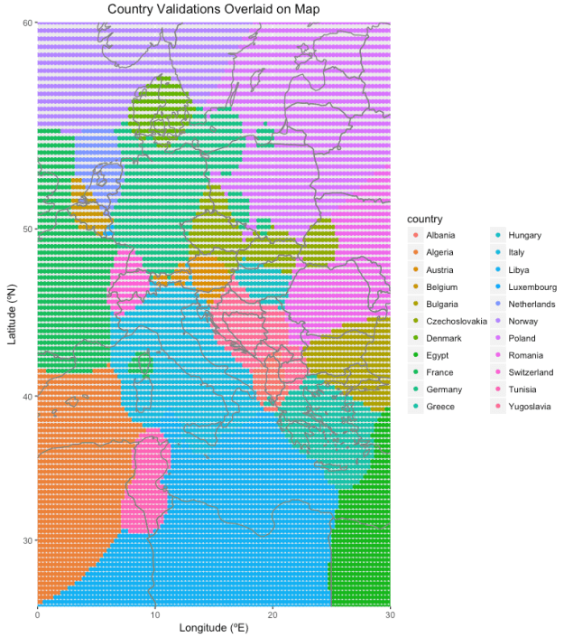
Again, the sloppiness of the decision boundaries is mitigated by only forcing the data to change their country assignments if the country they’re assigned to is ranked sufficiently poorly in predicted likeliness. I also did not spend any time tweaking non-contentious borders (such as Libya-Algeria).


After all aspects of the data had been cleaned, I was then able to confidently segment the data by country (trusting that all misspellings of each city are mapped inside a single country) to avoid the O(N^2) explosion of computation time for generating string distances for a vector of N strings, and fix spelling errors in city value. Having the most accurate city and coordinate information, I finally imputed missing coordinates using mean imputation based on city.


The final product shows good separation of data by country (though keep in mind that many borders, such as the Sudetenland and Alsace-Lorraine, were different back then, and many imperial colonies had not yet gained independence).

How to Process Textual Data Concisely, Efficiently, and Robustly in R

Links to code on Github: utils_factors.R


Executive Summary:

I created a library of efficient and robust level-editing functions in R that allow for elegant formatting and handling of string data in the form of factors. I created these out of need for cleaning textual data for my Shiny project, but have found them so useful that I regularly use them on textual data in other projects as well.


Motivations:

The impetus for creating this library of functions was how inefficient some factor-handling processes are in base R (and even with some useful packages designed for this work, such as Hadley’s forcats package). (For the Pythonians among us, R’s factors are analogous to pandas’ categoricals, and the levels of a factor (a vector of type factor) are the different categories that values can take.) With the need to format tens of columns of millions of rows of strings within a reasonable time frame for iterative improvement of the code I was writing, I simply couldn’t afford to wait half an hour every time I wanted to test if my new data pipeline changes had been successful or not. So I sought out ways to do more efficient processing of factors in R. At this point, I had already discovered the biggest bottleneck in my textual processing pipeline, which had been neglecting to use factors in the first place (instead, processing each unique string as many times as it appeared in the dataset). But I looked deeper and found a programming quandary begging to be solved. And beyond its relationship to factor handling in R, what I discovered has reshaped my approach to processing textual data in general.


Initially I had simply tested the new pipeline on small aliquots of data (say, 1% of the total), which helped, but strings, unlike numerical data, are less predictive in how they will respond to processing (a function may show issues for classes of numbers, such as negative numbers, numbers close to 0, or very large numbers, but there are simply too many different kinds of character strings). Furthermore, processing only 1% at a time limited my attempted fixes to roughly 1% of the errors at a time, as many of the errors were unique. Profiling didn’t lead me anywhere interesting, as it showed that some of the base R operations were slowing things down. Surely you can’t make things any faster without digging into C/C++, right?


Well, yes and no. I realized data.table’s speed improvements over many base R or Hadley-verse equivalents (dplyr and the like) come not only from being written in C but also by setting values by reference. That is, instead of forming a brand new dataframe in memory each time it’s modified, just modifying the original copy (already in memory) instead. R’s typical copy-on-modify semantics are exactly what you’d want for exploratory data analysis, wherein corrupted or lost data upon one accidentally imperfect exploratory query is the last thing you’d want. But the memory and processing overhead for making a copy every single time data are modified is a high price to pay in the context of a data pipeline (just make one copy first thing and forget about it until you want to process everything from scratch again). I did some tests and found that R’s slow factor handling was not due to the cardinality of the data (i.e. actually editing the factor levels as I was) but by the pure size of the data (i.e. from copying new data before each successive modification).


So I set about designing a set of R functions that would facilitate directly modifying factor levels by reference using data.table’s ability to directly edit column attributes. And aside from simply accessing the inner machinery of the data tables, I saw it as an opportunity to build a fully developed and idiomatic library centered around efficient factor level modification. A few of the design features I worked up to over time are uniformity in structure and use across the set of functions, placement of the vector of factors as the first argument to allow use with R’s piper (%>%), and invisible return of the edited factor vector to allow chained piping for an intuitive relationship between code structure and function. Below I’ll review what each function does.


format_levels(fact, func, …)

Replaces the factor levels with those same levels as modified by a function. Very useful for formatting text, like capitalizing entries. Now intuitive code like things_to_capitalize %>% format_levels(capitalize) is paired with extremely fast performance.


format_similar_levels(fact, pairings, …)

Same as the above, but processes the levels with an entire set of functions paired with a regex pattern for determining which specific levels get altered by which functions. Let’s say you want to capitalize only certain entries based on their content, that could be entry_data %>% format_similar_levels(“^association” = capitalize), which would capitalize all levels starting with “association”.


replace_levels(fact, from, to)

Sometimes you’d just like to replace a single (or multiple) levels with specific new value. Countries %>% replace_levels(from = “PRC”, to = “China”) is an example of that.


rename_levels(fact, changes)

Same as the above, but using a named vector instead, so the example would be countries %>% rename_levels(“China” = “PRC”). The new values are the names of the changes vector so that you can drop any unnamed levels to the empty string with an expression like countries %>% rename_levels(“unknown”).


rename_similar_levels(fact, changes, exact)

Same as the above, but using regex instead, so countries %>% rename_similar_levels(“Un.” = “^United “) would abbreviate all countries starting with “United” to “Un.” instead.


add_levels(fact, add)

Initialize a (currently-unrepresented) level. Responses %>% add_levels(“wants Python to start using brackets”) would allow a new bar of 0 height to be shown for the number of people who want Python to start using braces/brackets like everyone else.


drop_levels(fact, drop, to)

Makes these (probably unimportant) levels combine into some other (default empty string) category. Data %>% drop_levels(c(“unk.”, “unspecified”), to = “unknown”) turns both “unk.” and “unspecified” levels into “unknown”.


drop_similar_levels(fact, drop, to, exact)

Same as above, but with regex using a named vector, as with before.


drop_missing_levels(fact, to)

Combines all unrepresented levels into one (default empty string) level.


keep_levels(fact, keep, to)

Drops/combines all levels except for those specified in keep.


keep_similar_levels(fact, keep, to, exact)

Same as above, but with regex using a named vector, as with before.


reduce_levels(fact, rules, other, exact)

Decides which levels to drop/combine/otherize to the string specified in other (defaut “other”) based on regex.


otherize_levels_rank(fact, cutoff, other, otherize_empty_levels, include_ties)

Decides which levels to drop based on which ones are represented below a certain cutoff in rank (of frequency). Exact function behavior can be modified using the last two arguments, which are booleans.


otherize_levels_prop(fact, cutoff, other, otherize_empty_levels)

Same as above, except based on a proportion as cutoff (e.g. combine all levels that individually account for less than 1% of values).


otherize_levels_count(fact, cutoff, other, otherize_empty_levels)

Same as above, except based on a hard number cutoff.


And then there is a set of functions with the same names except ending with _by_col, which instead of taking a data.table’s single column vector and applying the functions, instead takes an entire data.table and applies the functions to each column (or a named subset of them).


This set of factor-editing functions does not technically have data.table as a dependency (it finds a way to do everything in base R without data.table if you don’t have it installed, since the functions do provide a convenient interface for working with factors regardless of the speed improvements), but it’s much faster using data.table’s set by reference.


There’s one more complicated function that does require data.table that carefully fills in missing data across two columns that are redundant or otherwise related (e.g. a country code and a country name). I initially just had it in mind for my Shiny project data’s code:value redundant structure, but I found I could also expand it to validate and fill in city:country (and other similar) relationships as well, as any one-to-one or many-to-one relationship will work. I could write an entire new article on this function alone, though, so I will cut things off here.


If you do any work with factors in R on large datasets, I’d try seeing what kind of performance (and simplicity) improvements you can achieve with data.table paired with this package.

Don’t Know Much About History: Visualizing the Scale of Major 20th Century Conflicts (Details)

Check out the code here while you read the article.


Executive Summary:

I used advanced programming features of R to make cleaning and organizing the data possible, especially in an efficient and highly iterative manner. I further used closures, function factories, and multiple layers of abstraction to make the code more robust to changes/refactorization and much easier to understand.


A general overview of the project is available here. (separate blog post)


This project was a challenge of programming fundamentals: execute a complicated task reliably in minimal time with readable code. Along the way I discovered some of the essential features in R—including R’s superfast data.table, unit testing methods and other features from the “Hadleyverse”/tidyverse, and built-in functional programming aspects—and wrote other features myself, such as efficient string editing through factors and conveniences allowed by R’s “non-standard evaluation” (for more reference on this see Hadley Wickham’s Advanced R).


First, an ode to data.table: it’s arguably the fastest data wrangling package out there, at least among the top data science languages like Python and R. It’s ~2x faster at common tasks than Python’s Pandas (and unspeakably faster than R’s native data.frame). I also like to think it has better syntax, as it’s written more like a query than a series of method calls. It allows value setting by reference, which prevents copying of the whole dataset just for slight modifications. It provides both imperative := and functional `:=`() forms, and even a for loop-specific form set() for those few times when one-line solutions aren’t enough. It allows easy control of output format (whether in vector or data.table form) and provides the convenience of non-standard evaluation without removing the flexibility of standard evaluative forms. It is tremendously flexible, expressive, powerful, and concise, which makes it an excellent choice for any data wrangling project. It really shines with larger (≥1GB) datasets, especially with its parallelized read and write methods, and enabled me to iterate quickly when designing my data cleaning pipeline for edge cases in the entire datasets I set out to process.


Functional programming was essential to staying DRY (Don’t Repeat Yourself—minimizing duplication) in this project. Having four similar datasets that were best kept separate to operate on, I created function factories for creating closures that would process each dataset as appropriate, and further bundled the closures together so one could essentially call a function on a dataset and get the expected results, despite the underlying implementation for each dataset perhaps differing from others. I wrote this program with a scalable design, as I had initially planned to start with just World War Two data and expand it once working with that data to also include the other datasets you can see in the final product. If my data source releases any more datasets, I’ll easily be able to fit them into the current framework as well.


The size of the dataset and the intricacy of the code provided an opportunity for automated unit testing to catch issues early. As I had to iterate through various designs of the data cleaning code many times to eliminate each separate issue I noticed, unit testing caught any unintended side-effects as soon as they happened and ensured that obscure data cleanliness issues didn’t rear their heads many steps later. Hadley’s testthat package proved very useful for this.


The raw string data presented in an inconsistent and hideous format. In order for tooltips to appear well-formatted to a human reader, I made the textual data conform to standard conventions of punctuation and capitalization. The extensive presence of proper nouns in particular required a fine-tuned approach that simple regular expressions couldn’t solve, so I created string formatting methods that I sought to apply to each row in certain columns. However, initial versions of my string formatting code, though successful, took several hours (half a day) to run, requiring that I rethink the programming or computer science aspects of my approach. Some vectorized (or easily vectorizable) methods only took a few minutes each to peel through a column of my largest dataset with over 4.5 million observations. So I figured out a way to effectively vectorize even the seemingly most unvectorizable methods. For instance, instead of splitting each row’s text into words and rerunning the word-vectorized proper noun capitalization method on all rows in the dataset, I discovered it was significantly more efficient (in R) to unlist the list of words in each row into a single large character vector (containing all words in all rows, one after another, with no special separation between words in a particular row and words in the next row), run the proper noun capitalization on that single long character vector, and then repartition the (now capitalized) words back into a list of words in each row. This single change improved the efficiency of the data formatting by nearly a factor of 10. Still, it was taking over an hour to run, and I investigated further ways to improve efficiency. I realized in particular that the Unit_Country field was editing the same ~5 strings in the same way over and over again for each row (of over 4.5 million rows), which was horribly inefficient. Much better would be to map each row’s string to a short table of possible string values, apply the edits to the reference table, and then unmap or reference the updated values as necessary. This is (more or less) exactly what factors do! Applying the same string formatting methods to the factor levels brought the total runtime down to a few minutes, which made fast iteration through data cleaning method variants easy. Still though, the methods seemed to take unusually long (over one second per operation) to update just a few string values, so I investigated further and discovered that R was copying the entire dataset each time a factor’s levels were altered (even using Hadley’s forcats package). I then found a way to update a factor’s levels in place by reference (thanks again to data.table), which brought the total runtime down to less than a minute, for a total efficiency improvement of over 1,000x. This efficiency improvement was essential for using iterative design to get the labels just right. Extensive use of the pipe (%>%) made writing the code substantially clearer and also makes it substantially easier to read, often obviating comments.


Additionally, I created a reusable fill_matching_values() method that fixes inconsistencies in one-to-one code-to-value mappings such as those found in the datasets for this project. Many of the values appeared as though they had been entered through Optical Character Recognition (OCR) technology, and there were plenty of labeling mistakes that needed fixing. The algorithm identifies the most common mapped value for each code and replaces all mapped value with that presumably correct modal (most common) value; analogously, the algorithm then fills in missing and corrects incorrect codes using the most common code that appears for each value. I first coded up a working form of this algorithm using basic data.table syntax and then vastly improved its efficiency (~10-fold) by implementing the lookup table using data.table’s more advanced, speed-optimized join syntax. Furthermore, I easily filtered the intermediate lookup table for duplicate or conflicting mappings, allowing my human eyes to double-check only the mistaken mappings and their corrections. (And I’m glad I did: I found a few misspellings that were more common than the correct versions, which were easily fixed manually in my data cleaning pipeline.)


Stylistically, the code still had a long way to go. I found myself repeatedly performing the same few operations on each column’s factor levels: dropping levels, renaming levels based on a formula, renaming specific levels with specific new names, renaming levels through regular expressions, grouping rare levels together under an “other” label, and running the same level formatting on multiple different columns. I created helper functions, almost like a separate package, for each of these situations. The formula-based level renaming function is an example of a functional: pass it a function, and it gives you back values (the edited levels). Different operations could be applied to the same column/vector by invisibly returning the results of each operation and using chaining.


Creating compositions of data cleaning functions greatly simplified the writing process and improved the readability of my code. I defined a functional composition pipe %.% (a period, or “dot”) mimicking the syntax in fully functional programming languages like Haskell, but found that my reverse functional composition pipe %,% (a comma) made the code even more readable. (Instead of f() %.% g(), representing f(g()), which places the first-executed operation last on the line, I sided with f() %,% g(), representing g(f()), which has the functions execute in the same order in which they appear in the line of code, separated by commas, as if to suggest “first f(), then g()”.)


Other infix functions simplified common tasks in R:

%||% provides a safe default (on the right) when the item on the left is null.

%[==]% serves a dual purpose: when a[a == b] is intended, it prevents writing a textually long expression a twice and/or prevents unnecessary double evaluation of a computationally expensive expression a.

The related %[!=]%, %[>]%, %[<]%, %[>=]%, %[<=]% are self-explanatory given the above.

%[]% analogously simplifies the expression of a[a %>% b], using non-standard evaluation and proper control of calling frames (the environment in which to evaluate the expression).

%c% (the c looks like the set theory “is an element of” symbol) creates a safe version of the %in% operator that assumes that the left-side component is a scalar (vector of length 1), warning and using only the first element of a longer vector if otherwise.


I also fixed a subtle bug in the base R tabulate() method as applied to factor vectors: when the last level or last few levels are not present in the vector, it completely drops them from its results. Under the hood, the default tabulate method evaluates factors from the first level to the level with the highest ordinal value (level indices 1 through max(int(levels)), reporting missing levels only when they’re not last in the list of levels.


I explored using parallel processing for the multicolumn data.table operations using mclapply() instead of lapply(), but the former was slower in every instance across every possible number of execution threads. I gained a small performance benefit from using the just-in-time compiler.


Finally, onto the finished product:

On the main (overview) tab, I plot out aerial bombing events on a map. Extensive controls allow the user to select which data to plot, filter the data by several criteria, and alter the appearance of the map to highlight various aspects of the data. Above the map, informational boxes display summations of various salient features of the data for quick numerical comparisons between conflicts and data subsets.


I allow the user to filter each dataset by six criteria, providing a comprehensive exploratory approach to interacting with the data: dates (Mission_Date), the target country (Target_Country), the target type (Target_Type), the country of origin (Unit_Country), the type of aircraft flown (Aircraft_Type), and the type of weapon used (Weapon_Type). In order to allow speedy performance when filtering millions of rows based on these arbitrary criteria on the fly, I set these columns as keys for each dataset, which causes data.table to sort the rows such that binary search may be used (as opposed to searching through the entire dataset). Furthermore, I wrote a full-structured method that queries the datasets using the minimum criteria specified, saving time. I update the possible choices for each filtration criterion based on the unique choices (levels) that still remain in the filtered datasets. Since this latter case involves performing an expensive and deterministic operation that returns a small amount of data—and potentially executing the same query multiple times—it is a perfect candidate for improvement through memoization, which I performed effortlessly with the memoise package.


The maps utilize a few features to better visualize points. A few different map types are available (each better at visualizing certain features), and map labels and borders may individually be toggled on or off. If the filtered data for plotting contains too many rows, a random sample of the filtered data is used for plotting a subset of the points. The opacity of points depends logarithmically on the number currently plotted (creating a plot of more numerous and more transparent points or more sparse and more opaque points). The opacity also depends linearly upon the zoom level of the map, so points get more opaque as one zooms in. The radius marks the relative damage radius of the different bombings (an approximation based on the weight of the explosives dropped, not based on historical data). The radii stay the same absolute size on the screen—regardless of zoom level—until one zooms in far enough to see the actual approximate damage radius, which I calculated based on the weight (or equivalent weight in TNT) of the warhead(s).


As hinted at earlier, each data point has a corresponding tooltip that displays relevant information in an easy-to-read format. (Each tooltip appears only when its dot on the map is clicked so as to not crowd out the more important, visually plotted data.) I included links to the Wikipedia pages on the aircraft and city/area of each bombing event for further investigation. (The links, pieced together based on the standard Wikipedia page URL format and the textual name of the aircraft or cities/areas, work in the majority of cases due to Wikipedia’s extensive use of similar, alternative URLs that all link to a given page’s standard URL. The few cases in which the tooltip’s link reaches a non-existent page occur either—most commonly—when an associated page for that aircraft or city/area has not been created, or when the alternative URL does not exist or link properly.)


The data are also displayable in a columnar format (in the data tab) for inspection of individual points by text (sortable by the data’s most relevant attributes).


Each dataset has its own tab (named for the conflict that the dataset represents) that graphs salient features of the data against each other. These graphs include a histogram and a fully customizable “sandbox” plot. The same filters (in the left-most panel) that the user has chosen for the map-based plots *also* apply for the graphical plots on these tabs, allowing the user to investigate the same subset of data spatially (the map plot), temporally (the histogram), and relationally (the “sandbox” plot).


The histogram and “sandbox” plot for each dataset are generated through function factories that create the same plots (with some minor dataset-specific differences, such as choices for categorical and continuous variables) for each dataset despite their differences, providing a uniform interface and experience for disparate datasets. Furthermore, the histogram and sandbox plot are responsive to user input, creating the clearest possible graph for each choice of variables and options. For example: choosing a categorical variable for the independent/horizontal axis creates a violin plot with markings for each quartile boundary; choosing a continuous variable creates a scatter plot with a line of best fit.


For those interested in investigating the historical events themselves (as opposed to their data), I’ve included tabs that relate to these events through three different perspectives: that of a pilot, that of a commander, and that of a civilian. The pilot tab shows interesting historical footage—some documentary-style, and some genuine pilot training videos from the time—related to each conflict. The commander tab shows the progression and major events of each conflict on printed maps. The civilian tab shows, using a heatmap, the intensity of the bombings over the full courses of the wars.


Throughout this project, I came to appreciate the utility of multiple layers of abstraction for effective program design. Throughout the project, I have used layers of abstraction to mirror structurally the way a human would think about organizing and implementing each aspect of such a project. In this way, I’ve saved myself a great amount of time (in all stages of the project: writing, refactoring, testing, and deploying), made the program more resilient to change, and saved the reader (including my future self) a magnitude of headaches when poring through the code.


For one, the UI itself is laid out very simply in nearly WYSIWYG (what you see is what you get) form using abstracting place-holder functions that represent entire functional graphical components. The codes themselves are organized extensively into several files beyond the prototypical ui.R, server.R, and global.R used in most Shiny apps. This made (for me) and makes (for the reader) finding the appropriate code sections much easier and more efficient (for instance, by localizing all parameters in a parameters.R file, and further grouping them by function, instead of having them spread out through multiple other files, or—even worse—hard-coding them), and also comes with the added benefit of allowing some more generalizable code sections to be easily repurposed in other projects in the future.

Don’t Know Much About History: Visualizing the Scale of Major 20th Century Conflicts (Overview)

Check out the app here while reading the article.


Executive Summary:

I built a comprehensive app to plot, filter, and analyze World War Two and other major 20th century conflict data using R Shiny. Users can investigate these historical events spatially (on maps), temporally (through histogram data), and relationally (through scatter and bar plots), and even animate the progression of these conflicts over time.


Skip straight to the technical parts! (separate blog post)


I. Introduction

History is about human experiences of the past, and few of us have access to these shared stories anymore.

Sure, my grandfather served in the Pacific Theater in the Navy, but he died before I was born, and I got to hear a few stories from my great uncles who flew supply runs during World War Two as well, but I really don’t have a sense for what living through this period in history was like. Neither do most people alive at this point.

For this first project, I wanted to use the power of data visualization in R through Shiny to give people a sense of the immense scale of the conflicts of the 20th century that I can hardly understand myself.

(Why Shiny? Because Shiny makes “app-ifying” data through R incredibly easy while still providing comprehensive functionality—I’d highly recommend it.)


II. Motivations – Why I Chose These Data

I obtained these datasets, which were just published within the past several months, from data.mil. I was frankly shocked to see the US military jumping on the Open Data bandwagon, so I couldn’t help but take a peek at the dataset. Within it I found an enormous collection of data points that each carry heavy weight as a human story. I decided to make a tool for anyone passingly curious in, say, WW2 history to be able to explore the history in an interactive and intuitive way.

The data themselves are records of aerial bombing operations performed by the United States military (reportedly every single bombing run made, with a few caveats) along with a small collection of records of aerial bombing operations performed by other nations in conjunction with the US military surrounding four important conflicts of the 20th century: World War One, World War Two, the Korean War, and the Vietnam War* (or “Vietnam Era Conflict”, as it used to be classified by the Library of Congress due to an official declaration of war never having been made). I have no way of proving that these data are exactly representative of the larger conflicts (though data.mil insists they are comprehensive), so I will shy away from making large-scale comparisons, though the data appear representative and complete enough for me to feel confident in the utility of this tool I’ve created. Each point represents a story that had significant impact on the people and places involved, even if much of the residue of these conflicts has been washed away by the ages, as craters have been filled in and entire cities have been rebuilt. I implore the user to dive into the individual point data first to best get a sense of the importance of this project.

These datasets also provided significant challenges to myself as a programmer: many numerical data were missing, inaccurate, or incomplete, textual entries were difficult to process, and the sheer volume of the data (nearly 5 million total observations altogether across hundreds of columns) required a special level of care to make such an exploratory tool possible for people to enjoy using.

My hope is that anyone—from the amateur historian to the student with a passing curiosity in these histories—will be able to develop a sense of these events through this tool.


III. Overview

One of the most important senses I want to give people is a sense of scale, both in terms of space and magnitude or intensity.

To give people a sense of the shear amount of land (and sea) area affected by these conflicts, I’ve plotted out the unique targets of aerial bombing operations for all of these wars on a central “overview” map. Each conflict has a separate color to make comparisons easy (compare WW1—when airplanes were just beginning to be used in combat—and WW2—just some 25 years later—for instance). The data are sampled heavily in order to make plotting (especially within the platform of Shinyapps.io) feasible. I have also allowed the opacity to change based on how many points are plotted for improved visibility–notice that few points appear distinct and many points become a cloud. Even just from a bird’s eye view, you can see how much territory was affected by these conflicts, and you can see how the conflict was distributed across space and time. Feel free to adjust the map and label style to your liking as you explore the spatial distributions.

I wanted to give people an otherworldly sense of magnitude by displaying the number of missions flown, bombs dropped, and weight of bombs dropped in the info boxes at the top. These update based on your selections of wars to include and specific date ranges to inspect. You may find a few noticeable distinctions between the different wars based on the magnitude of their bombing campaigns.

It should be noted that the weight shown in pounds is just the weight of the deliverable or the warhead itself—that is, a 10-pound explosive propelled by 90 pounds of rocket fuel would be counted as a 10-pound bomb. Astute observers may have already noticed the relative magnitude of the atomic bombs dropped near the end of the Second World War as well—they have been listed according to their weight in TNT explosive equivalent.

Each point comes with a clickable tooltip that provides a little snippet of the event as far as the data can show. The text has been heavily processed to appear reasonable and well-formatted to the human eye, and missing or incomplete data has been replaced with general descriptions. I consider this a key feature of the app, as many memorials around the world are made most effective by showing individual names and stories. Often just a small snippet (an amount that’s digestible) is more impactful than a full report, as there’s simply too much information in its entire form, and focusing on a few small points that one can grasp onto (along with an understanding the scale of the conflict) can provide one with the best intuitive understanding.


IV. Sandbox

I mentioned that I wanted to create a tool for exploring history through data, and while the overview plots are intuitive and informative, I wanted to give any user, regardless of programming skill, the ability to further investigate trends and patterns the data. I call it the sandbox, as it’s a tool that allows the user to create new things in an exploratory and creative manner. It lets people explore trends between whatever two variables they’d like as a hypothesis generator.


V. Animation

I also wanted to give users a sense of the progression of these conflicts, so I added an animation component to all of the graphs and maps. The app will automatically cycle through the entire date range of the conflicts selected by year, by month, or by week, to show the different stages of each war. For instance, with World War Two, you can see the European Theatre open up before the Pacific Theatre, followed by the liberation of France, followed by the sudden crescendo of bombings throughout Japan, culminating in the atomic bombings at Hiroshima and Nagasaki.


VI. Historical Interests

Have you ever wondered where the expression “taking flak” comes from? Watch a “How to Avoid Flak” training video (genuinely used for World War Two pilots) in the Pilot tab. For an overview of major battles and events, see the Commander tab. For an eye on the sky as a civilian, see a heatmap of bombing intensity in the Civilian tab.


Feedback:

Needless to say, if you have any suggestions (or find any errors in the app or its code), please don’t hesitate to contact me.


Dig Deeper:

That’s it for the surface of the project. The true magic lies in what’s under the hood: how the data were prepared. To learn more about that, see my technical blog post on this project.

Predicting House Prices During a Declining Economy: A First Look into Kaggle Competitions

Executive summary:

I used supervised and unsupervised machine learning algorithms—primarily Multiple Linear Regression, Principle Component Analysis, and Clustering—to accurately predict prices for Sberbank’s Russian Housing Market Kaggle competition. I developed these models using a data pipeline that cleaned the data based on my research findings, tidied the data into Third Normal Form, transformed features to appropriately fit the models used, engineered new features where appropriate, imputed missing data using K-Nearest Neighbors. I then used the Bayes Information Criterion and residual plots to identify important and sensible underlying factors that affect housing prices, and I created a predictive model with validation.


Motivations:

My first glance into the world of Kaggle competitions was an interesting one: international sanctions, a collapsing oil economy, a nascent coffee culture, and tax fraud all contributed significantly to a proper understanding of Sberbank’s Moscow housing market dataset. As a business-facing problem, successful analysis of such a dataset must include two main components: insights brought forth by interpretation of the data, and accurate predictions brought forth by the best model. Below I present how to go about this tall task and a review of the major factors that impact the nominal price of housing in Moscow.


The objective of this competition was to accurately predict prices of housing units in Moscow for Sberbank given the data it provided on Kaggle. This included a set of macroeconomic data from the years 2010-2016 (overlapping Russia’s conflict in Crimea and its international response of increasing sanctions, along with the collapse of the Russian oil economy that followed), and a set of housing unit data from the same period, with prices for the period from 2010 to April 2015, and an unpriced test set from April 2015 onward used for model scoring and ranking.


Aside from typical issues with missingness and inaccuracy that one expects in any real-world dataset, first attempts at modeling the data performed unsatisfactorily due to an insidious issue with the quality of the data: a predominance of uniformly cheaply-priced units in the far left tail of the price histogram. See below:

This slideshow requires JavaScript.


Such effects were further compounded by the fact that the Support Vector Machine I constructed failed to classify which units might end up selling at such a “subsidized” price and which would sell at prices within the typical distribution for Moscow houses. This vexing class of housing units ended up having a much simpler explanation after I briefly looked into Russian capital gains law: tax fraud. It’s apparently common practice to report significantly lower house prices for the purposes of property tax evasion, so I assigned all suspicious prices (the glut of prices clustered at or just below the RUB 1 million and 2 million property tax cut-offs) to missing and imputed instead, which greatly improved the accuracy of the model. Sometimes the answer to a data conundrum comes from outside the data.


Additional preliminary looks into the data revealed that Sberbank would strongly benefit from a data engineering team. The dataset Sberbank provided was primarily composed of highly redundant features slapped together into an inconsistent and amorphous blob that violated basic Tidy Data principles in multiple ways. In light of this, I developed a data cleaning and tidying pipeline that was key in my team’s success in the competition. Here are some of the ways I confronted these issues:


I set out to build an interpretable multiple linear regression model with the goal of providing useful insights into the Moscow housing market (as opposed to using a more powerful black-box model). I constructed this model using features engineered in three ways: native features transformed to avoid violating requirements for use in a linear regression model (e.g. linearity, homoscedasticity, and a normal-like distribution), composite features generated to avoid issues associated with multilinear regressions (i.e. PCA to resolve collinearity), and novel features engineered to better relate a feature’s effect on price (e.g. thresholding and further transformations).


Prices were distributed nearly log-normally (a Box-Cox transformation showed best-fit lambda close to 0), so I log-transformed price figures. Other features (such as apartment size) showed much-closer-to linear fit upon log transformation as well (along with much-closer-to normally distributed errors), so for best incorporation into the multilinear regression, I log-transformed those features as well. These log-log relationships also displayed much lower heteroskedasticity compared to those of the untransformed features, further necessitating the transformation. Other features, particularly temporal economic figures, required separate modeling, as they were duplicated with differing frequencies (e.g. Sberbank copy-pasted weekly-measured figures for each other weekday and copy-pasted monthly-measured features for the rest of the month so that one independent measurement masqueraded as multiple separate observations). See an example of the heteroskedasticity below:

This slideshow requires JavaScript.


Matrix correlation plots (below) revealed that the dataset consisted of two sets of mostly highly correlated data. The first set contained many of the most explanatory features, so I selected the most useful of these for use in the model and left the rest out. I reduced dimensionality in the second set through PCA and found a handful of useful features (principle components) that I also added to the model. After investigating the significant principal components (left of the “elbow” in a scree plot) for interpretability in addition to significance, I also included the top 10 PCs from the set of distance features and the top 4 PCs from the set of coffee-related and object count features.

Kaggle correlations.png


I explored reducing the complexity of the raion feature using agglomerative clustering, though the lackluster results of such explorations (in addition to the failure of raion characteristics to model raion residuals of the best model missing the raion feature against the true values) further strengthened my sense that the coefficients of the raion categoricals are more a measure of neighborhood popularity (je ne sais quoi) than anything else. It is reasonable to suppose that factors outside (and unmeasured by) the dataset would also be affecting prices; demographic and cultural information for each raion was limited, and such effects would effectively be captured by a catch-all feature like the raion categorical itself.

So what factors do Muscovites react strongly to when pricing a housing unit, and in what ways?


Muscovites like:

  • larger units (by far the biggest contributor to price)
  • desirable neighborhoods (the second-largest contributor)
  • units in better condition
  • living in taller buildings
  • living on higher floors within those buildings
  • expensive coffee in the center city (hipsterism?)
  • proportionally larger kitchens
  • living closer to parks
  • living within walkable distance of a metro station
  • living near big shopping areas


Muscovites don’t like:

  • living too far away from the city center (another major contributor)
  • living right by highways
  • living right by railroads
  • living right by power transmission lines
  • living right by oil refineries
  • panel or breezeblock construction materials
  • old buildings
  • buildings with contemporary-style architecture, regardless of age


Additionally, they’re willing to pay more for ownership-style apartments than investment-style apartments (or house-buyers may be less savvy than real estate investors).


Conclusion:

While Kaggle-style competitions tend to reward black box models, kernel-copying, and hyperparameter-hacking through repeated submissions (submitting models fudged by different amounts until the score happens to improve as a kind of over-fitting), I took it as a way to learn how to better perform regular data science, using only the kinds of models and techniques that I could justify to a supervisor looking for insights. It was outperformed by boosted-tree methods in terms of log-error, but held its own very well against less flexible models (being the best multilinear regression among my bootcamp cohort) and solidly accomplished its objectives of providing actionable insights into how potential house buyers in Moscow make pricing decisions.